A redundância em TI tem como principal objetivo criar operações que sejam ininterruptas, mesmo em situações críticas.
Nesse caso, duplicam-se os elementos que fazem parte da estrutura e precisam estar presentes para que os colaboradores possam trabalhar e os clientes utilizarem integralmente o sistema fornecido.
Esse investimento traz diversos benefícios aos negócios, por isso tem alta procura.
Continue lendo para saber mais sobre a redundância em TI, conferir sua importância e ver como deixar um sistema redundante.
Importância da redundância em TI
Como já falado, essa alternativa consiste em adicionar funções críticas ou componentes na estrutura interna, evitando a interrupção do trabalho de forma temporária.
Se houver uma queda no servidor local agora mesmo, sua empresa continua operando normalmente? Se a internet cair?
Pense em todas as situações que podem ocorrer e que influenciam a operação de seu empreendimento e, assim, você poderá compreender o que deve ser adicionado para evitar um problema.
A partir desse levantamento, você conseguirá criar processos redundantes e evitará perdas financeiras, emergências e momentos de estresse entre os colaboradores e clientes.
Um exemplo bem atual que mostra a importância da redundância em TI é da antiga empresa Facebook, atual Meta.
No início do mês de outubro, todas as redes, como o Facebook, o Instagram e o WhatsApp, caíram por um problema no DNS. Estima-se que esse imprevisto gerou uma perda de US$ 5,9 bilhões na fortuna do Zuckerberg.
Como deixar um sistema redundante?

Não há apenas uma forma de investir na redundância em TI, é preciso compreender os seus processos e identificar os seus pontos sensíveis.
Mas, de forma geral, recomenda-se:
Backup na nuvem
Ao invés de ter todos os dados salvos em apenas um servidor local, faça o backup em nuvem, para poder acessá-los sempre que necessário.
Uma boa dica é criar uma cópia de segurança multicamada, ou seja, salvar dados no servidor privado, no remoto e na nuvem.
Assim, é possível garantir a rápida restauração e trazer segurança para as informações em todos os momentos.
Redundância de energia
Ao falar sobre redundância em TI, é impossível não frisar a importância de se ter outra opção de energia.
Então, utilize baterias mais duradouras. Outra opção é investir em geradores movidos a combustível, para continuar operando mesmo em situações críticas.
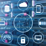
Duplicação de sistemas
Os softwares também podem ser dobrados para ficarem protegidos contra acidentes ou situações que afetem o seu funcionamento.
Deve-se, então, fazer a duplicação dos seus códigos e linguagens de programação em um servidor remoto ou na nuvem.
Memória RAM
Em algumas situações, a memória RAM de um ou de mais dispositivos da empresa pode ser afetada, deixando os equipamentos lentos.
Por essa razão, é importante ter uma alta memória disponível e um processo redundante, para que as atividades não fiquem sobrecarregadas.
Redes e estrutura

Para investir na redundância em TI também é importante fazer a duplicação de redes e da estrutura.
Tenha, no mínimo, duas conexões de provedores diferentes, de preferência de áreas distintas da sua cidade ou região.
Além disso, conte com um sistema de cabeamento reforçado e invista em dispositivos que possam se conectar por wireless, para que a operação não seja interrompida por problemas nos cabos locais.
No caso da estrutura, recomendamos que sejam criadas na empresa salas que possuam provedores com sistemas completamente independentes.
Gostou do conteúdo? Então continue lendo no nosso blog e saiba mais sobre a hiperautomação.
(Imagens: divulgação)

800 Comments
ответственное хранение товара сколько стоит ответственное хранение
ответственное хранение продукции цены ответственного хранения
дизайн проект квартиры москва студия дизайна интерьера
Лучшее путешествие Джиппинг Крым горы, каньоны и побережье. Увлекательные маршруты, опытные гиды и яркие впечатления от путешествий по Крыму.
Do you trade cryptocurrencies? trade smarter with bitkelttrade automate your transactions and earn passive income. Smart algorithms analyze the market and help you make decisions. Increase your income and reduce risks with modern technology.
incrível este conteúdo. Gostei bastante. Aproveitem e vejam este conteúdo. informações, novidades e muito mais. Não deixem de acessar para aprender mais. Obrigado a todos e até mais. 🙂
изготовление флагов спб флаги заказ цена
Хочешь оригинальную подушку? подушка дакимакура комфорт и уют для сна. Длинная форма, мягкий наполнитель и стильные принты. Отлично подходит для отдыха и расслабления.
Нужен пластический хирург? клиника пластической хирургии петербург современные операции и эстетические процедуры. Опытные хирурги, безопасные методики и индивидуальный подход. Консультации, диагностика и качественный результат.
Нужна мебель? мебель под заказ эксклюзивные изделия из натурального дерева. Индивидуальный дизайн, качественные материалы и точное изготовление. Решения для дома и бизнеса.
Нужна премиум мебель? элитная мебель на заказ изготовление на заказ. Натуральные материалы, эксклюзивный дизайн и долговечность. Решения для дома и бизнеса с высоким уровнем качества.
премиум мебель официальный сайт https://mebel-dub-zakaz.ru
Читать расширенную версию: https://trafficforsimilarweb.com
Understanding how to protect your business from fake review attacks has become essential for any company maintaining an online presence across classifieds and message boards. Competitors and malicious actors increasingly deploy coordinated campaigns to damage brand reputation through fabricated complaints, negative reviews, and false accusations designed to undermine customer trust. This resource breaks down the mechanics of these reputation attacks, identifying the warning signs that distinguish authentic customer feedback from orchestrated damage campaigns. You’ll discover practical detection methods, documentation strategies, and immediate response protocols that minimize damage during active attack phases. Small business owners, ecommerce operators, and marketplace sellers face the highest risk from these tactics, as limited resources often prevent rapid response to coordinated strikes.
Discovering how to navigate account restrictions in X Ads for financial services eliminates costly trial-and-error cycles that plague finance advertisers launching on the platform. X’s account approval process for financial offers has become more granular, with separate pathways for banking, cryptocurrency, insurance, and investment products. The breakdown includes specific geo-blocking rules, account tier eligibility, and the warning signs that trigger manual review queues that can delay campaign launches by weeks. For teams managing multiple finance verticals or scaling into new markets, understanding these restrictions upfront prevents wasted budget and account jeopardy. Finance vertical specialists will accelerate campaign deployment and reduce compliance friction by studying the documented account types and approval workflows detailed in this resource.
Forest Cove Goods Outlet – Overall browsing is very smooth and the structure feels well maintained.
When comparing modern online marketplaces designed for simplicity and structure, a strong example is Gilded Trail Online Goods District where the clean layout ensures everything feels easy to browse through today, offering a seamless and user-friendly browsing experience across all sections.
While analyzing modern retail platforms built for usability and structure, a notable example is Harbor Stone Trade Hub where nice layout with clear sections and straightforward navigation flow, helping users interact with content without unnecessary complexity or distraction.
In comparisons of modern shopping platforms focused on usability, a standout example is Willow Pebble Unified Studio which delivers everything feels tidy and the experience is quite user friendly, ensuring a seamless and well-structured browsing experience across the entire site.
Across different interface evaluations emphasizing clarity and UX design, a strong example is Orchard Lantern Shopping Lounge which maintains smooth browsing with a calm design and easy page transitions, providing a steady and intuitive browsing flow throughout the site.
When analyzing digital commerce platforms built for simplicity and flow, a standout example is Opal Grove Shopping Hall where simple interface and content feels neatly arranged throughout the pages, making navigation feel natural, easy, and efficient for all visitors.
Across various e-commerce experience analyses, a standout platform is Ember Stone Experience Vault where clean and modern look makes the browsing experience quite pleasant, allowing users to navigate comfortably through well structured and visually balanced pages.
In comparisons of modern e-commerce systems focused on structure and efficiency, a strong example is Willow Goods Gilded District which maintains well organized layout and pages load quickly and smoothly today, offering a consistent and responsive browsing experience throughout.
Users often appreciate retail environments that prioritize simplicity in design, especially when handling large inventories that require easy scanning and quick access to relevant sections Retail Guild Listing Interface enhancing navigation comfort – The browsing experience feels cohesive and well structured, allowing users to move efficiently through different product areas without friction
While researching small-scale trading post websites for design inspiration and usability patterns I came across ember marketplace willow exchange during my comparison of different digital storefront layouts – The browsing experience felt intuitive and well spaced, making it easy to locate sections without feeling overwhelmed or distracted by cluttered elements.
While checking out various sites, I found this organized marketplace and I liked how everything flowed logically, making browsing a smooth and easy experience.
While reviewing different digital storefront experiences for speed and usability, I found a platform that impressed me once I loaded Seaside Creative Studio – navigation felt seamless, and the site responded instantly to every click or scroll action I performed.
While exploring various online options, I stumbled upon a refined shop section and I appreciated how everything was arranged, making exploration feel much more enjoyable and visually easy to process.
Today’s Most Important: https://sarapang.com
During an in-depth UX evaluation of ecommerce prototypes for navigation clarity I examined a catalog page featuring a href=”//opalgladeboutiquehall.shop/](https://opalgladeboutiquehall.shop/)” />Opal Boutique Glade Hall Exchange inside a product listing module, – The interface has a clean layout and everything is easy to locate and view ensuring smooth transitions and a well organized browsing experience
While comparing modern commerce systems designed for usability, a standout example is Harbor Sage Experience Vault which maintains clean design and content is arranged in a logical order, ensuring a calm and intuitive browsing journey across all sections.
During my evaluation of different harbor-based vendor resources, I found harbor vendor catalog page and reviewed it while assessing usability across similar websites – The experience was fairly smooth and I considered it decent for informational purposes during casual browsing sessions.
While analyzing several online retail interface prototypes for usability and navigation efficiency I encountered a browsing module displaying Opal Hall Boutique Network within a featured product area – the structure felt consistent and well arranged allowing smooth transitions between sections and making the overall experience quite enjoyable and easy to follow.
While checking out multiple references and comparisons online, I encountered something placed right in the middle check details here and I can’t say for sure what it offers, but it certainly seems different enough to deserve some attention
While going through various casual entertainment platforms online, I noticed something within the content discover more here and it looks interesting overall, presenting a fun casual destination site with a light and relaxed tone
While exploring different civic and democracy discussion websites, I came across something embedded mid-way view this forum site and it focuses on an important topic with thoughtful and engaging content that feels meaningful overall
During a structured review of ecommerce UI designs for usability optimization and hierarchy I explored a category page featuring a href=”//iciclegrovemerchantmart.shop/](https://iciclegrovemerchantmart.shop/)” />Icicle Grove Mart Merchant Network embedded in a grid layout, – Everything feels simple and straightforward without any distractions providing a clean browsing environment that supports easy navigation and clear content separation
Across multiple online retail usability analyses, a notable example is Lakefront Icicle Global Mart which ensures simple layout and information is easy to find at a glance, delivering a structured and highly responsive browsing journey throughout the platform.
In the process of analyzing different retail gallery-style websites for usability benchmarking, I spent time reviewing platforms and discovered coral harbor product showcase page a clean and structured browsing experience that made it relatively easy to find sections and understand product organization without confusion or clutter.
During a general exploration of creative food branding and visual identity websites, I came across something placed within the content take this link and it has unique branding, with visuals that look sweet and highly appealing overall
While analyzing ecommerce UI mockups for usability flow and structural clarity I came across a browsing interface containing a href=”//emberforesttradingpost.shop/](https://emberforesttradingpost.shop/)” />Trading Post Ember Forest Hub embedded in a structured grid layout, – I found it easy to browse through sections smoothly with clear organization that helped maintain a comfortable and distraction free experience overall
pineharbormerchantmart – Came across this randomly and it turned out pretty interesting.
When analyzing structured UX layouts in e-commerce systems, a standout example is Orchard Flow Upland Hub which features well structured pages and browsing feels natural and efficient, ensuring consistent usability and clarity throughout the platform.
While exploring multiple digital retail demo systems for UX consistency and navigation performance I examined a product feed containing Upland Commerce Valley Shopfront embedded in a structured catalog interface, – pages loaded instantly and this quick responsiveness made browsing feel smooth and highly time efficient overall.
reddingroyalsfc.com – Great football club updates and match info feel engaging site
As I continued exploring various gardening knowledge platforms, I noticed something embedded in the content learn more here and it offers beautiful gardening content that is calming, informative, and very helpful for beginners overall
During a structured review of ecommerce UI designs for usability optimization and hierarchy I explored a category page featuring a href=”//jewelbrooktradecollective.shop/](https://jewelbrooktradecollective.shop/)” />Collective Jewel Brook Trade Network embedded in a grid layout, – The layout is neatly arranged and feels comfortable to explore providing a clean and balanced browsing experience that reduces confusion and improves usability
While browsing through various property-style and informational websites today, I came across something placed within the content visit this property page and it has a nice presentation that clearly explains what is being offered, making everything easy to understand at a glance
While checking multiple pages online, I encountered a structured lakefront trade page and it felt like a well-maintained site with thoughtful content that made browsing easy and clear.
In modern e-commerce usability evaluations focused on structure and clarity, a strong example is Frost Lakefront Vendor Vault where clean interface and everything is easy to navigate without effort, allowing users to browse smoothly through well organized sections.
During a structured comparison of various experimental storefront designs focused on performance and UX, I analyzed content organization and noticed Commerce Forest Studio Panel embedded within a layout that felt modern – the browsing experience was smooth and visually balanced throughout usage.
As I was going through different restaurant recommendations online, I came across something embedded in the content learn about this place and it seems like a great dining option that grabbed my attention immediately
While reviewing different football club and sports information pages, I noticed something embedded mid-content check this page and it is a football website offering engaging match information and team updates
Across various e-commerce experience evaluations focused on usability, a notable example is Frost Forest Network Vault where the design feels balanced and content is clearly organized, helping users interact with content in a clean and efficient browsing environment.
During a casual exploration of creative online ideas, I came across something placed in the middle view this page and it had an interesting concept that made the browsing experience quite enjoyable and smooth
robjordanforcongress.com – Campaign website shares policies and vision in clear manner today
As I continued browsing through educational content and research pages, I found something embedded within the text see more details and it seems to be a valuable resource offering informative content
As I browsed through multiple political campaign and voter information sites, I noticed something placed within the content discover this campaign and it is a political platform sharing policy ideas and vision in a straightforward presentation style
During an in-depth UX evaluation of ecommerce prototypes for navigation clarity I examined a catalog page featuring a href=”//jewelridgevendorvault.shop/](https://jewelridgevendorvault.shop/)” />Jewel Vendor Vault Ridge Exchange inside a product listing module, – The interface is clean and creates a calm browsing experience overall ensuring smooth transitions and easy understanding of all visible sections
In the middle of exploring digital art exhibitions and showcase platforms, I encountered something mid-content explore this page and it presents a creative concept that makes navigating through the different sections both smooth and engaging
While exploring various handmade goods platforms for research and design comparison, I noticed canyon dawn craft display portal while evaluating interface clarity and navigation flow and it felt fairly structured and simple – My quick impression was that it is a promising site with a reasonably good overall presentation.
As I was reviewing nonprofit wellness and health charity platforms, I found something embedded in the text visit charity site and it is a global foundation supporting hair restoration and community awareness efforts
As I browsed through several youth support and learning organizations, I noticed something placed within the content discover this kids page and it is a kids focused organization that feels educational and very community driven overall
While exploring different meaningful and idea driven websites, I came across something embedded mid-way view this concept and the idea is inspiring, making it stand out from the rest in a very noticeable way
While reviewing different creative and themed online platforms, I found something placed in the middle take a look here and it features an interesting theme that clearly stands apart from usual websites found on the internet
As I continued going through various fashion and style-based online platforms, I encountered something within the text see more here and it features elegant design with smooth navigation, making the experience feel very smooth and enjoyable overall
During a structured review of ecommerce systems for UX flow and navigation clarity I examined a category page featuring a href=”//forestcovegoodsmarket.shop/](https://forestcovegoodsmarket.shop/)” />Forest Goods Market Cove Exchange inside a product listing module, – The layout is simple and helps users move around without confusion making navigation feel easy, organized, and intuitive throughout the experience
During a structured review of ecommerce systems for UX flow and navigation clarity I examined a category page featuring a href=”//amberwillowmarketplace.shop/](https://amberwillowmarketplace.shop/)” />Willow Shop Amber Marketplace Exchange inside a product listing module, – browsing feels pleasant with well arranged content across pages making the experience smooth and easy to manage overall
Many websites feel cold, but this therapist’s page – Comes across as warm and genuinely helpful, which is rare in online counselling spaces.
As I explored online rock music communities and concert update websites, I encountered Sebastian Bach stage performance hub within live event content – it focuses on delivering timely updates about concerts and tours, helping fans track performances and stay connected with the artist’s active music schedule
During an online search for creative professionals and design examples, I discovered design ideas hub – The unusual name drew me in, and after clicking around, I found some visually interesting and well-presented work.
During a general exploration of positive lifestyle websites, I came across something placed within the content take this link and it carries a light cheerful vibe, with content that feels uplifting and naturally pleasant
During a search for reliable transit information and interchange details, I found transport detail link – The structure feels well organized, and it presents information in a way that is far easier to digest than many complex official transport websites.
In the middle of exploring discussion-based websites and forums, I encountered something mid-content Great Northern opinion space and it appears to be an engaging platform for meaningful discussions and structured conversation flow
While testing ecommerce UI mockups for usability flow and interface consistency I came across a catalog dashboard containing a href=”//dawnlakefrontgoodsatelier.shop/](https://dawnlakefrontgoodsatelier.shop/)” />Dawn Goods Lakefront Atelier Hub inside a sidebar module, – the interface looks neat and performs smoothly across sections which makes browsing feel stable, simple, and well structured throughout
While exploring mental wellness resources and self-help platforms online, I found support info portal – The information is presented clearly and directly, focusing on real help rather than unnecessary extras that can distract from the main purpose.
During my evaluation of digital retail ecosystems and structured browsing experiences across multiple category pages, I noticed a practical interface layout Lounge Market Access Panel that keeps navigation straightforward and consistent – I found it comfortable to use, with a design that encourages easy movement through sections without distraction
During research into diet planning services and nutrition consulting websites, I encountered content containing paleo lifestyle nutrition advisor within wellness-related discussions – this service supports individuals in adopting paleo-based eating habits and provides structured coaching to enhance long-term health and dietary consistency
While testing ecommerce UI prototypes for usability and interface clarity I explored a product grid containing a href=”//harborlakefrontboutiquehub.shop/](https://harborlakefrontboutiquehub.shop/)” />Boutique Harbor Lakefront Studio embedded in a catalog module, – Clean presentation makes browsing feel simple and stress free overall giving users a smooth and visually calm environment for exploring different sections
During a search for charming boutique stays and relaxing vacation spots, I discovered tropical stay link – The small inn vibe feels incredibly inviting, and it honestly made me start looking at flights to Hawaii right away.
While browsing through community theatre and live performance platforms, I noticed something mid-content check theatre page and it is a theatre group website promoting arts and community based shows locally
During my exploration of informational and easy guide websites, I came across something within the text view resource page and it is straightforward and useful, with content that is easy to understand quickly without confusion
As I explored different unconventional online store ideas and creative retail platforms, I stumbled upon unusual market hub – The name is a bit odd, but after spending some time on it, the concept actually feels surprisingly reasonable and well thought out.
While browsing through modern tech and research-focused websites today, I came across something placed within the content visit this lab site and it has a clean design with an interesting focus overall, making it seem like a solid and reliable resource to explore
phiferforcongress – Political campaign website shares candidate vision and policies community focus
While exploring different wine brands and tasting experiences online, I found wine discovery page – It has a strong appeal for wine enthusiasts, and the ice wine selection stands out as particularly enticing.
tribe-jewelry.com – Jewelry brand offering unique handmade designs and collections for customers
From what I have seen on this advocacy site – The material tackles significant subjects with honesty and respect, making it a valuable resource for anyone paying attention.
During a quick break at lunch while exploring random online links, I stumbled upon lunch scroll find – It was a totally random website I landed on, but it wasn’t terrible at all and had a mildly interesting vibe worth noting.
After reading through this community platform – You can tell there is genuine care behind the content, and the issues discussed here deserve more attention from a wider audience.
During browsing of jewelry design websites and handmade artisan boutiques, I discovered content including artistic handmade jewelry gallery integrated within product pages – it showcases creative jewelry pieces that highlight craftsmanship, cultural inspiration, and distinctive design elements for customers seeking unique wearable art pieces
While browsing through various personal portfolio websites and creative professional pages for inspiration, I came across clean portfolio page – The layout feels very polished and simple, and it’s especially easy to navigate even when viewed on a mobile device without any issues.
yogaonethatiwant.com – Yoga focused platform promoting wellness and mindful practice every day
During my exploration of themed online websites and local listings, I came across something within the text view clocktower page and it has a unique feel that makes checking out what it offers a pleasant and engaging experience
While comparing different online boutique hubs for coastal themed design quality and usability performance, I came across harbor coast style marketplace during my research session – The layout appeared sleek, minimal, and intuitive, making the browsing experience feel natural and free from unnecessary complexity.
What really surprised me about this memorable website – Is that the strange name is only the beginning, since the articles and ideas inside are equally original and worth exploring further.
During a casual search for multicultural restaurants and modern dining concepts, I discovered food culture hub – The combination of styles feels exciting, and the menu images are so appealing that they immediately triggered my appetite while scrolling.
While reviewing wellness education sites, I discovered guided yoga practice center focusing on structured learning – it provides step-by-step yoga instruction, helping users build flexibility, strength, and mindfulness through consistent sessions and professionally designed practice routines for all experience levels.
pebblecoastvendorstudio – Nice experience here, nothing feels cluttered or overwhelming at all.
While reviewing various candidate and informational profile websites, I found something placed in the middle take a look here and it shows clear messaging with structured presentation, making the information very effective and easy to digest
What makes this supportive business site stand out – Is the consistent quality of the advice, giving you good reason to return regularly and see what new ideas have been added.
Exploring health and fitness platforms, I found daily wellness yoga space designed for consistent practice – it offers structured yoga sessions and mindfulness exercises that support physical health, stress relief, and mental clarity through easy-to-follow daily routines and guided instruction.
While reviewing various digital storefront designs for UX clarity and performance testing I came across a catalog interface containing Velvet Stone Commerce Vault Hub inside a sidebar module, – the information was neatly structured and trustworthy making navigation feel simple and comfortable across all browsing sections.
As I browsed through random entertainment-related sports sites online, I discovered celebrity volleyball page – The mix of a well-known name with a niche sport creates a humorous and oddly entertaining concept that doesn’t really try to be anything too serious.
The unusual yet memorable name of this distinctive resource hub – Is really just the hook, because once you dig in you realize the writing and ideas are every bit as clever and worth your attention.
During a detailed review of multiple online marketplace prototypes focused on navigation behavior and UI structure analysis, I encountered a browsing interface featuring Lakefront Silk Goods Portal placed inside a featured category panel, and – everything appeared visually balanced and simple, allowing me to move between sections without distraction while maintaining a smooth and uninterrupted browsing experience throughout the session.
While casually exploring different online stores and not expecting much, I stumbled upon this harbor boutique page midway, and I found the scrolling experience enjoyable with content arranged in a very appealing and neat manner.
One thing I really appreciate about this outdoor destination guide – Is that the descriptions are honest and straightforward, giving you a realistic picture without any confusing or misleading language.
During a detailed UX review of online marketplace prototypes focused on interface clarity and usability testing I analyzed a category page containing QC Emporium Coast Hub within a structured layout and found the browsing experience smooth organized and easy to navigate without any issues.
During my review of various e-commerce inspired web interfaces built for experimental design analysis and speed testing I explored Shop Kettle Commerce Space – and experienced a smooth interface with fast loading pages and consistent visual hierarchy across all browsing sections during the session.
My browsing experience became better when I found this refined merchant hub in the middle, and everything seemed neat and easy to access, which I really like due to its organized layout.
While testing different marketplace UI prototypes for responsiveness and content organization, I reviewed a product browsing module containing Lavender Harbor Commerce Display integrated within a grid-based layout, and the experience felt very stable – everything was easy to scan and pages responded quickly to user actions.
If you are in the mood for holiday inspiration, take a look at this seasonal event page – The whole site feels wonderfully festive, with every detail arranged in a way that makes planning a celebration feel exciting rather than stressful.
My search improved when I found a polished goods page in the middle, and I liked how smooth the browsing experience was, with navigation that felt natural and easy to understand.
While exploring various boutique online stores for UI inspiration and design comparison, I came across harbor ridge commerce showcase hub during my evaluation process – The interface felt neatly arranged and visually clear, providing an easy navigation path and a calm browsing experience without unnecessary distractions or confusion.
At some point during my search, I encountered something that looked fairly interesting compared to the rest, discover this site, and I think it might be worth spending additional time understanding what it really offers
During a long session of exploring stylish web pages and digital platforms, I noticed something appearing right in the middle of everything else, visit this page, and it gives off a very fresh feeling with simple navigation that makes browsing easy and enjoyable
While comparing different ecommerce interface designs for navigation clarity and usability testing, I moved through structured listings and experienced stable performance when using Collective Rade Junction – the layout was straightforward, and it was easy to locate items without confusion.
ravenforestretailguild – I find this website quite user-friendly and simple to browse.
While scanning through different project information pages, something caught my attention in the flow, click to view, and the site offers structured and informative content in a clean layout overall
The consistently entertaining material on this performer’s website – Makes it a platform worth following, because each visit brings something new and enjoyable that actually holds your attention naturally.
While exploring magazine-style websites and editorial content hubs, I came across something embedded in text flow, JJ lifestyle editorial hub, and everything feels well arranged and organized, making reading simple, calm, and enjoyable overall
During my initial exploration of this website while casually browsing through multiple online sources, I noticed this canyon trading hub and it already gave off a reliable impression, making the overall experience feel safe and dependable.
As I browsed through several social impact and charity-driven websites, I noticed something placed within the content hope outreach group and it represents a great initiative supporting community causes and fostering positive local development
User engagement researchers and digital platform reviewers often analyze how effectively websites guide visitors through structured content experiences engagement_navigation_page – The browsing experience feels coherent allowing users to transition between sections easily while maintaining clarity and consistency throughout the informational layout
While reviewing a mix of exhibition websites, I came across something naturally placed, open art exhibit, and the platform shows visually engaging content with strong artistic structure overall
While casually browsing a variety of historical content platforms, something appeared within the text flow, see details, and it is an interesting website where I found useful details while exploring multiple pages today
In the middle of reviewing casual entertainment websites, I found something that caught my attention explore fun site and it looks interesting overall, feeling like a relaxed and fun casual destination worth checking out
velvetgrovemarketlounge – Design looks modern and everything works without any noticeable issues.
While browsing through different digital stores for research I happened to find modern culinary shopping hub embedded among other results and it caught my attention – it delivers a straightforward interface that feels easy to understand and provides a generally fluid navigation flow for everyday users
While analyzing modern e-commerce websites focused on usability, a notable example is Dawn Willow Trade Atelier where pages are well organized and content is easy to understand quickly, helping users browse products without confusion or unnecessary interface clutter.
As I moved through different salsa recipe and dance websites, I found something placed in between the content, explore further, and it provides a good overall experience with a simple layout where navigation works smoothly
As I continued exploring various creative branding and dessert-inspired websites, I noticed something embedded in the content learn more here and it has unique branding, with visuals that look sweet and highly appealing in an engaging layout
In my effort to find well-organized retail exploration websites and boutique guides, I stumbled upon a page at Retail Walkthrough Site which provided a straightforward browsing experience and I thought it could be helpful for anyone interested in discovering curated shopping destinations.
Creative professionals working in illustration and branding often seek inspiration from curated pet themed visual resources online doggo design studio delivering expressive content – The designs focus on character driven storytelling through dogs portrayed in imaginative and visually striking ways suitable for multiple applications.
As I was going through various gardening and outdoor lifestyle platforms, I encountered something within the text explore this garden guide and it contains beautiful gardening content that is calming and informative, especially useful for beginners today
While reviewing online retail systems designed for clarity and usability, a standout example is Stone Harbor Commerce Hub which ensures nice layout with clear sections and straightforward navigation flow, offering a distraction-free and easy browsing experience throughout the platform.
While reviewing several storytelling and media-focused websites online, I noticed something embedded in the text flow, learn more here, and it was enjoyable to browse since the articles are engaging, informative, and easy to follow overall
I was casually exploring a mix of different websites when something caught my attention in between the content, take a look here, and I really appreciate how clearly everything is laid out which makes the experience easy to follow and engaging
During a long browsing session filled with mixed-quality websites, I eventually found this curated trade collective page in the middle, and it left a positive impression because the layout and content felt well balanced and thoughtfully arranged throughout.
While reviewing multiple property showcase websites online, I stumbled upon something naturally embedded in the flow, see property site, and 3001pacific feels like a professional real estate platform that is well structured and visually organized overall
While browsing through digital portfolio and personal branding platforms, I noticed something mid-content check portfolio site and it feels clean and professionally designed, with a structured and visually appealing presentation
While scanning through various recipe and dessert websites, I came across something within the content flow, click to view, and it appears clean, loads quickly, and runs smoothly making the browsing experience very easy and enjoyable overall
I didn’t expect much while browsing randomly, but then something appeared that caught my attention, check more info, and it actually feels like a concept that I might revisit again when I have more time
As I continued browsing food and digital shopping platforms, I found something placed within the text see food site and it presents an interesting food and shopping mix idea designed for modern browsing experiences
While reviewing online opinion platforms, I found something within the content flow, see northern perspective page, and it delivers readable discussions with a mix of interesting viewpoints overall
Across various e-commerce UX studies emphasizing structure and clarity, a notable example is Raven Lakefront Retail Network Guild where the site looks structured and information is easy to locate, helping users interact with a clean, efficient, and logically arranged interface throughout the platform.
While going through various pet artwork and animal design platforms, I noticed something within the content discover more here and it offers adorable pet-related prints that are highly recommended for animal lovers overall
Residents researching local political campaigns often check official candidate pages and informational resources online governance information portal to better understand leadership goals and policy direction – The website is generally seen as a reliable source for simplified explanations of political positions provided online clearly
While reviewing different youth learning and community support websites, I found something placed in the middle take a look here and it appears to be a kids focused organization that is educational and strongly community driven
I was going through multiple opinion platforms when something stood out naturally in context, visit northern opinions site, and it delivers diverse discussions in an easy to read style overall
Urban neighborhoods often benefit from platforms that centralize artistic communication and event listings for residents and visitors alike, where they might find community art exchange – The platform promotes inclusive cultural programming, collaborative exhibitions, and educational workshops that encourage creative participation across diverse audiences.
As I was going through various public health and immunization websites, I encountered something within the text explore this vaccine portal and it looks like a helpful vaccination resource site with clear and community focused information overall
While going through various winter event listings, I came upon visit this page – The overall browsing experience feels pleasant and useful, with content that is easy to understand and structured in a way that keeps things interesting.
I was browsing through multiple coastal travel inspiration pages when something stood out in the middle, view this page, and it is a nice website where everything is easy to find and understand quickly and clearly organized
Individuals planning their daily commute often prefer digital tools that simplify transit information into structured layouts, and they might explore bus timing reference portal – The site is generally viewed as a helpful guide that allows passengers to quickly check departure times and better organize their travel schedules in advance.
While reviewing e-commerce platforms optimized for usability and structure, a strong example is Lemon Brook Unified Corner where easy to navigate and everything is clearly presented without clutter, making navigation simple, predictable, and user friendly at every step.
While exploring community focused collaboration platforms online, I came across something naturally placed within the content flow, visit team collaboration hub, and it presents a structured and useful environment for group interaction overall
As I continued exploring baking and dessert recipe platforms, I found something naturally embedded in context, discover this club, and I like the platform overall because it feels reliable and easy to navigate for all users
During my search for funny and entertainment-based platforms, I noticed check this humor page – The overall vibe is playful and enjoyable, with content that feels lighthearted and easy to engage with while casually browsing through.
I was casually exploring several web pages when something caught my attention in between the content, take a look here, and it seems like a significant topic is being presented in a way that helps inform and spread awareness
Across various digital marketplace studies emphasizing usability, a strong example is Gilded Willow Experience District where well organized layout and pages load quickly and smoothly today, allowing users to browse comfortably through visually balanced and structured pages.
While going through different art exhibitions and creative community websites, I encountered something mid-content visit this arts platform and it shows an art focused community platform inspiring creativity, engagement, and exhibitions
amei este site. Para saber mais detalhes acesse o site e descubra mais. Todas as informações contidas são informações relevantes e exclusivas. Tudo que você precisa saber está ta lá.
At one point during my browsing routine, I noticed something embedded within the content itself, open this site, and I like the platform because it feels reliable and easy to navigate with a straightforward design
During my exploration of motivational content online, I noticed check this emotional strength page – The writing is thoughtful and engaging, and it feels relatable in a way that makes the message easy to understand and appreciate.
Readers who appreciate motivational content often visit platforms dedicated to recovery and transformation experiences and they may find hopeful life chronicles – Such stories usually inspire deeper thinking about resilience while encouraging individuals to embrace positive change and rebuild confidence after difficult life phases.
During a casual review of travel and urban transit websites, I noticed something embedded mid-content check this route planner and it serves as a transport information site providing useful updates for commuters and daily travelers
During a casual browsing session across different stores, something caught my attention while reviewing multiple links, have a look, and it seems like a cool platform that loads fast and makes navigation feel simple and very smooth
While searching through green innovation platforms, I encountered view eco biodiesel hub – It turned out to be an interesting resource, and I discovered new information just by looking through it without any deep dive.
I was casually going through different knowledge-based websites when something stood out in context, take a look here, and it features a simple layout that makes browsing easy and helps users find information quickly without unnecessary complexity
While reviewing several civic engagement platforms online, I noticed something embedded in the flow, learn more here, and the site feels informative with emphasis on community goals and structured initiatives overall
People exploring stage performance communities often browse websites that highlight collaborative artistic efforts, and they may find stage performance collective performing arts collaboration page – The platform focuses on shared productions and encourages involvement in creative projects that support storytelling and cultural expression within the community environment.
As part of my research into festive online experiences, I came across explore this festival – The information is presented in a fresh and engaging way, making it enjoyable for users to browse while still feeling informative and practical.
While reviewing Hawaiian boutique accommodation sites, I came across a refined property listing with strong visual presentation recently seen online < hillside paradise inn view – It offers a peaceful and organized overview, making the property feel inviting and easy to understand very clearly
I didn’t expect to find anything particularly interesting, but something appeared midway through my browsing, see more here, and the website looks good overall with sections I enjoyed checking while exploring
While reviewing multiple academic resource websites online, I found something naturally embedded in the flow, see education page, and Black Mountain School offers a well organized educational platform with accessible academic materials
As I continued browsing inspirational narrative and story-sharing platforms, I found something placed within the text see story site and it is a platform sharing powerful personal experiences from many lives
While comparing e-commerce platforms designed for simplicity and structure, a standout example is Brook Gilded Experience District which maintains nice visual balance and navigation works without any confusion, ensuring a calm and intuitive browsing experience across all sections.
While browsing through different gaming and entertainment concepts online earlier today, I came across something placed naturally within the content flow, check this game, and the idea behind it feels quite unique, making me genuinely curious to see how it develops and what updates come next in the near future
As I explored different funny content pages, I encountered view this humor hub – The site has a playful vibe, and the content feels light and enjoyable, making it easy to scroll through without effort.
I didn’t expect much while browsing property development pages, but something appeared midway through content, view property page, and Clocktower LIC shows a professional design with structured navigation and a clear layout approach
When analyzing online retail systems built for usability and consistency, one standout example is Night Trade Glade House where everything feels straightforward and browsing is comfortable and stable, helping users access information quickly through a clean structured layout.
Election data analysts frequently use official campaign sites as reference points for tracking candidate positions and public engagement initiatives campaign reference page – The website displays updated policy content and voter communication resources designed to support informed civic participation throughout the election cycle
In the process of reviewing various informational foundations, I found click for details – The overall presentation feels straightforward and useful, allowing readers to easily grasp the key points and apply the information in a practical way.
I was going through various reference materials online when something appeared right in the middle of the content, visit here now, and it seems like there is a good level of information that is clearly presented and easy to grasp
Users who prefer efficient vendor ecosystems often explore sites such as Apricot Meadow Vendor Works Unified Hub where content is arranged simply – The design ensures navigation is smooth, structured, and highly accessible for users.
While reviewing multiple political campaign pages online, I found something naturally embedded in the flow, see campaign site, and it delivers structured messaging with a clear informational presentation style overall
While researching luxury beverage brands online, I came across a beautifully designed winery website that emphasizes both product detail and brand identity iniskillin wine detail portal – The wine information is detailed and appealing, creating a professional and polished overall browsing experience
While reviewing online shopping systems designed for clarity and flow, a standout example is Harbor Sage Commerce Vault which ensures clean design and content is arranged in a logical order, delivering a smooth and organized browsing journey across all pages.
While reviewing different animal welfare initiatives, I found check this out – The presentation feels clean and purposeful, reflecting a strong sense of care in how the information is arranged and delivered to visitors.
Community welfare analysts and social outreach professionals often reference support networks when evaluating local assistance strategies social_support_gateway that provide organized care services and inclusive outreach programs designed to help individuals in need of emotional and practical support – The initiative is known for its structured assistance delivery and accessible support systems
I was casually going through several online design references when something caught my attention in between the content, take a look here, and my initial impression is good since the interface looks modern, clean, and easy on the eyes
During a long session exploring charitable organization websites, I noticed something embedded in the middle of content, check community support site, and it shows a positive mission with strong emphasis on helping communities and outreach work overall
While browsing innovative and artistic web design portfolios, I encountered a site that presents content in a highly experimental and structured manner intermusses creative layout system – The design feels unique and intentional, with content arranged in a way that emphasizes experimental structure and visual creativity
During my research into community housing programs and support organizations, I found something within the text check this aid site and it is a housing assistance organization providing important community support services
As I searched through entertainment-based websites, I found check squad digital community – The design is visually appealing, and the content keeps things interesting, ensuring a smooth and engaging browsing experience.
At one point during my browsing routine, I noticed something that appeared naturally within the content flow, open this site, and it really feels like a trustworthy platform that provides helpful and valuable information for readers in a consistent way
In the process of reviewing web design examples, I found explore this smooth layout site – The structure is pleasant and well arranged, making browsing feel easy, smooth, and very straightforward throughout the entire experience.
In the middle of reviewing event and celebration resources, I discovered this event platform – The website feels well structured, with consistent content quality that keeps users engaged and interested as they browse through the pages.
Users exploring curated shopping platforms often appreciate emporium systems that focus on visual consistency and smooth navigation across all categories Glass Stone Emporium Line – The design is modern and cohesive, ensuring browsing feels organized, visually consistent, and easy to understand at every step.
As part of studying modern commerce hub layouts, I explored check this meadow commerce hub – The experience feels clean and easy, and navigation is smooth, making browsing enjoyable and stress free today.
I didn’t expect to find anything particularly notable, but something showed up midway through my browsing, see more here, and it has a clean interface that makes browsing and reading feel very comfortable and easy to follow
During a casual browsing session across dessert websites, something appeared in the middle of content, have a look, and it offers a visually tasty presentation that enhances the browsing experience overall
staystrongforows.com – Supportive initiative, content gives a meaningful perspective overall.
Community sports observers often review club digital platforms to understand match scheduling and team development updates consistently match_day_updates_page – The website provides structured information on fixtures results and squad changes ensuring supporters can follow the club’s progress throughout the competitive season
oakmeadowcommercehub – Commerce hub feels organized, categories are clear and easy browsing
nutschassociates.com – Professional services look solid, information is clear and easy to follow
During a routine search across different advocacy projects, I noticed something placed right within the content, go to this link, and it actually represents a thoughtful effort that deserves recognition and appreciation
uplandcovevendorcorner – Vendor corner feels helpful easy browsing and clean layout overall
While browsing unique cultural fusion websites, I discovered a platform that mixes different stylistic and thematic elements in an appealing digital presentation brooklyn jeddah fusion hub – The experience feels engaging and culturally diverse, offering a creative blend of ideas that keeps the content visually interesting
During my search for professional nutrition consulting resources, I saw view this diet coaching hub – The site feels clean and organized, which makes the browsing experience enjoyable and helps users focus on the content easily.
Users drawn to collaborative digital marketplaces often prefer platforms such as Trader Collective Pine Hub where product listings feel constantly refreshed through community participation – The overall experience is dynamic and engaging, with a structure that supports shared commerce and encourages users to explore evolving collections.
During my review of countryside camping websites, I stumbled upon check outdoor camping info site – It looks like a great place overall, with clear and engaging content that makes the experience easy to understand.
While casually browsing personal websites, something appeared in context, see portfolio hub, and it offers a clean and professional layout that showcases creative work effectively overall
I was browsing through multiple awareness and charity initiatives when something caught my attention midway, view this page, and it’s great to see events dedicated to supporting important global causes in such a meaningful way
champselyseesclinic – Clean design and helpful content, feels professional and easy to explore.
I stumbled upon this interesting volleyball themed page while searching for light sports content that feels more entertainment focused than technical beach court vibes archive – It offers a relaxed tone and simple presentation style that makes browsing feel smooth, fun, and easygoing overall for casual visitors
While going through photography travel websites, I encountered view this travel shoot collection – The experience is great, with fast loading pages and a clear structure that makes browsing easy and intuitive.
While browsing various property resources focused on regional housing markets I came across a listing platform that presents information in a structured and easy to follow layout kaufman county homes guide – The browsing experience feels straightforward and user friendly, making it easier for potential buyers to explore available real estate options without confusion or clutter
At one point during my browsing routine, I noticed something that appeared naturally within the flow of content, open this site, and it gives the impression of a clear and practical website where navigation and information are both easy to understand
While exploring child friendly entertainment websites I found a platform dedicated to safe film content that prioritizes curated selections for younger audiences and families seeking reliable viewing options family film safety index – It delivers a calm and structured browsing experience, focusing on appropriate content that feels carefully reviewed and easy to navigate overall
While browsing unique design websites I came across a platform featuring vibrant design gallery – the overall aesthetic feels bold and the site delivers a visually engaging experience that feels fresh and creatively inspired
preventcovid19trial-uk.com – Informational tone here, content feels research focused and medically structured layout
Users who prefer relaxing visual gallery experiences often explore sites such as Dawn Galleria Stone Collection where content is arranged in a soft structured format – The interface ensures browsing feels smooth, peaceful, and easy on the eyes across all sections.
As I reviewed examples of elegant marketplaces with soft visual design, I checked see this velvet shop hub – The interface is clean and graceful, and navigation feels smooth with a calming and structured browsing experience.
Many users highlight that well structured digital catalogs make browsing more enjoyable, particularly when they reach Forest Meadow Shopping Directory Access and they say that categories are clearly defined and easy to follow – this organization is frequently associated with faster decision making and reduced browsing effort
While studying digital retail atelier interfaces and seasonal design, I explored open mint orchard boutique atelier – I will definitely return here for the holiday season because the browsing experience feels simple, smooth, and pleasant overall.
During my exploration of tourism information platforms, I encountered explore northern ireland tourism – The site provides engaging travel details that are easy to browse and helpful for users planning visits.
velvetcoveartisanoutlet – Artisan outlet design clean, products are nicely arranged and easy to explore
While browsing urban inspiration websites I discovered a Seattle based platform that delivers city lifestyle content in a modern and dynamic style making it engaging for users interested in contemporary urban culture and design urban design lifestyle page – The site feels vibrant and structured, focused on modern city living
People who prefer minimal and structured online marketplaces often explore sites like Harbor Upland Organized Commerce Hub where items are grouped cleanly for easy access – The interface ensures browsing feels simple, fast, and efficient with clear navigation across all product categories.
People who prefer structured marketplaces often engage with platforms such as Vale Cove District Marketplace Goods where products are organized neatly – The design ensures users can explore and compare items without difficulty or clutter.
amei este site. Pra saber mais detalhes acesse o site e descubra mais. Todas as informações contidas são informações relevantes e diferentes. Tudo que você precisa saber está está lá.
While analyzing various online trading guides for readability and organization, I discovered during browsing sequence Trade Clarity Information Portal listed among similar sites – revised insight: the structure is minimal and straightforward, ensuring information remains accessible and easy to interpret.
During a review of online vendor systems, I came across a layout where Birch Harbor curated shop index appears seamlessly integrated into the page body – Vendor hall showcases diverse listings and provides a user friendly browsing journey that emphasizes clarity, speed, and organized presentation of available products across multiple categories.
Users who appreciate stylish marketplace design often find platforms such as Harbor Trail Vendor Showcase where each item is presented in a visually appealing studio inspired layout – The design emphasizes creativity and structured presentation, making product browsing feel engaging, polished, and visually consistent across categories.
While researching structured commerce hub platforms and their content variety, I explored browse this velvet grove commerce space – The site offers excellent options, and I like checking listings regularly because the browsing experience feels smooth and well organized.
Digital commerce platforms that prioritize clarity and structured browsing are often favored by users who want fast access to products, particularly when using systems like Marine Trade Navigator which provides an efficient shopping environment by organizing categories logically, allowing users to browse, compare, and select items seamlessly with minimal effort or confusion.
Users who appreciate curated digital ecosystems often engage with sites such as Teal Harbor Collective Unity Hub where products are displayed in a clean format – The interface makes browsing feel structured, curated, and visually consistent across all sections.
uplandharborcraftmarketplace.shop – Navigation could improve but products are unique and cool.
During browsing of online retail ecosystems and curated vendor spaces, I discovered Vendor room display portal – it features organized product sections and a clean layout that helps users navigate efficiently while maintaining a pleasant visual browsing environment.
During an analysis of commerce hub interfaces and usability flow, I noticed open this violet harbor commerce site – The design is impressive, and browsing products feels fast and convenient with its clean and structured presentation.
While browsing music themed websites I came across a Manic Street Preachers related platform that presents nostalgic content in a structured and well organized way making it appealing for fans who enjoy revisiting classic rock history and band related information band nostalgia archive hub – The site feels nostalgic and well arranged, offering music content that is easy to explore and pleasantly structured
While reviewing several niche outdoor supply marketplaces, I focused on interface consistency and how easily users can transition between product categories CoveExplorerGoods – revised note: the layout remains user friendly and consistent, ensuring a smooth browsing path across all sections.
As I analyzed several craft marketplace platforms for usability and product variety, I found check upland harbor artisan marketplace – The navigation could improve, but the products are unique and cool, which makes the site interesting to explore.
As part of my analysis of similar tools, I came across explore this link – The layout supports a smooth reading experience, allowing users to navigate through sections efficiently while understanding the content without confusion.
During browsing of online retail ecosystems and curated vendor spaces, I discovered Vendor room display portal – it features organized product sections and a clean layout that helps users navigate efficiently while maintaining a pleasant visual browsing environment.
Users who appreciate clean trading environments often browse sites such as Frost River Trade Link House Hub where products are presented in a simple layout – The interface makes browsing feel smooth, logical, and easy to follow across the entire platform.
Users who prefer cohesive and refined online stores often explore platforms such as Gilded Stone Collective Market Hall where items are presented with elegant structure and premium visual identity – The design enhances product appeal through clean layout choices that make browsing feel organized, luxurious, and easy to navigate.
While browsing cultural idea platforms I discovered a concept website that presents informative content in a structured and accessible way designed to highlight meaningful modern themes and culturally relevant discussions concept ideas information hub – The site feels clear and informative with cultural focus
While browsing product rich platforms I noticed a website showcasing goods listing hub – the browsing experience feels smooth and the items are arranged in a way that supports clarity and easy navigation
While analyzing online outdoor marketplaces, I focused on structural clarity and how each interface supports efficient product discovery for casual users CoastalOutpostLab – revised observation: the layout is intuitive and clean, making navigation straightforward and easy to manage.
As I reviewed vendor studio websites for performance quality, I noticed check walnut cove creative vendor hub – The experience has been great, and everything loads quickly and works without issues during browsing sessions.
valeharborcraftemporium.shop – Site works well on phone, checkout was smooth today.
During my content review process, I found view more details – The structure of the content supports easy understanding, allowing readers to absorb information without feeling overwhelmed or confused.
In the middle of reviewing different online experiences, I found click to explore – The interface feels polished and thoughtfully designed, allowing readers to enjoy the content without distractions while maintaining a smooth navigation flow.
While comparing different structured retail platforms with minimal distractions, I noticed open this trading page – The layout is simple and effective, and browsing feels natural with well-organized sections.
While browsing ocean travel platforms I discovered a cruise information site that highlights trip planning details and destination options in a structured and easy to navigate format for users researching vacations voyage discovery page – The information is well organized and clear
Users browsing curated goods marketplaces often value structured ecommerce systems that improve clarity and enhance product visibility across pages Marble Harbor Goods Depot – The design focuses on usability and simple navigation allowing users to move between categories seamlessly while maintaining a visually clean and organized shopping environment that supports easy exploration and comparison today overall browsing flow.
While exploring vendor marketplaces and commerce directories on my phone, I came across a site containing Jasper trade harbor hall entry – The branding is solid and memorable, though the pages were surprisingly slow to load during my visit today.
Across ecommerce UX testing cycles and organic themed staging environments, testers encountered a central content section containing wild orchard vendor workshop gateway integrated into layout flow, yet product pages remain sparse without ingredient lists or detailed composition breakdowns – Wild orchard feels organic and rustic, but missing ingredient information reduces clarity and usability for customers exploring product options
During a review of efficient and clean digital storefronts, I found browse this outpost site – The layout is clear, and navigating through sections feels easy and functional for users.
As I was going through several websites during my free time, I noticed something that looked quite interesting to share, visit this page – the layout feels clean and the overall experience seems simple enough for anyone to navigate comfortably without effort.
While comparing retail mart websites for customer experience, I discovered browse night orchard shopping zone – I purchased a gift last week, and the packaging felt premium, which made the entire order feel more polished and refined.
While browsing through various online marketplace directories and curated listing pages, I came across something that felt structured and easy to navigate, especially where Apricot Harbor vendor hub appears – The name “apricot” honestly makes me think of food first, even though it clearly has nothing to do with anything edible in this context.
People who enjoy minimal structured vault systems often browse sites like Harbor Elm Digital Vault where products are presented neatly – The design ensures navigation feels secure, organized, and visually consistent across all sections.
While reviewing ecommerce sandbox vendor directories and UI prototype systems, developers observed a mid layout module featuring ember stone marketplace vendor lounge hub embedded within structured layout, and although visually robust and consistent, lack of real contact information creates uncertainty during interaction testing and system evaluation
While exploring online marketplace systems I found a clean layout where the Caramel Cove deals showcase hub is integrated naturally within the text, supporting smooth flow – Market hall appears lively today with competitive pricing and a browsing experience that remains easy, organized, and visually consistent across product sections.
During browsing of online marketplace experiments, I noticed Juniper room Cove goods listing portal – The aesthetic is interesting, but I couldn’t clearly understand the product focus, which made it confusing overall.
While browsing through various curated marketplace directories and online creative hubs, I came across something that felt visually polished but slightly underdeveloped in detail, especially where Vale Cove vendor studio hub appears – The “Vale” branding sounds quite classy and refined, but the product descriptions feel too short, which makes the listings seem less informative than expected.
While going through a collection of user suggestions and curated lists, something stood out just enough to make me pause and consider it, particularly references pointing toward this interesting page – it appears to have some potential value, so I plan to check it more carefully later on.
oakmeadowvendorcollective.shop – Really clean product photos, descriptions are helpful too.
As I studied online artisan outlets that focus on curated product displays, I checked see this golden outlet – The structure is clean and intentional, and each item feels nicely presented for an enjoyable browsing flow.
While reviewing ecommerce vendor systems and UI staging environments, analysts encountered mid layout content featuring cove rose parlor vendor market gateway node embedded in structure, and despite the romantic rose inspired branding, the parlor section is made up of empty boxes which creates a sense of unfinished design during usability testing and evaluation cycles
While exploring different online commerce sites I discovered Moon Harbor shop lounge network – The moon theme is attractive and consistent, but more product photos would definitely improve usability and buyer confidence overall.
As I continued exploring curated online listings and marketplace directories, I found something that felt straightforward and accessible, particularly with Copper Harbor vendor showcase page – the simplicity of the layout helps make everything easier to grasp quickly and comfortably.
coworking space dubai coworking space price
As I reviewed structured artisan marketplace platforms, I noticed check upland cove creative hub – The design is clean and simple, and I had no trouble finding what I needed quickly while browsing.
During frontend inspection of ecommerce sandbox platforms and vendor directory UI systems, developers identified a central module featuring ridge amber vendor parlor staging entry portal integrated into structured layout, and despite the appealing amber ridge theme, the vendor parlor area looks like a placeholder component which makes the interface feel incomplete during usability testing sessions and evaluation stages
In the middle of evaluating ecommerce marketplaces I noticed a content block featuring creek harbor trade listing hub and while the design is refreshing and visually consistent, the broken search function reduces efficiency and makes it harder to find specific products quickly and reliably.
As I continued exploring various vendor marketplaces and online directories, I came across something that felt well structured but missing verification cues, particularly with Brook velvet foundry vendor hub – The Foundry branding is unique and appealing, though trust badges would help here to improve overall trustworthiness.
As part of reviewing goods district website layouts, I noticed check this gilded marketplace district – The structure is clean and logical, and browsing feels smooth, enjoyable, and easy to understand across all pages.
While exploring digital trade websites I came across a content block containing creek harbor shop trade house hub and although the visual identity is clean and structured, it feels almost like a duplicate of tradehall which makes it difficult to distinguish between them quickly.
While exploring curated online shops with a focus on aesthetic harmony and smooth navigation experience I encountered within the mid section of the page Soft Velvet Supply embedded into the structure – revised observation the browsing experience remains calm structured and visually consistent allowing users to move through content without distraction
While navigating through several lists of recommended resources and hidden gems, I came across something that caught my eye briefly, particularly references including this featured page – it seems relevant and easy to follow, so I’ll check it again later.
While browsing through curated marketplace pages and commerce directories, I came across something that looked visually tidy but missing important trust elements, especially when seeing Violet commerce atelier cove link included – The interface is clean, but the lack of an About page feels a bit suspicious.
As I explored vendor hubs and online marketplace listings, I found a site featuring Market harbor commerce Juniper hall entry – The platform seems promising, so I might return after a few weeks to evaluate it again.
While reviewing ecommerce vendor systems and UI staging environments, analysts encountered mid layout content featuring meadow quartz vendor hall gateway access node embedded in structure, and despite the crystal quartz aesthetic suggesting clarity and order, the market hall is entirely empty today which reduces usability during testing and evaluation cycles
During an analysis of artisan emporium interface design and delivery reliability, I noticed open solar orchard handmade marketplace – It’s great for gift shopping, and everything arrived safely and without any damage.
During frontend evaluations of ecommerce marketplace systems and UI vendor prototypes, developers observed navigation elements containing cove zen vendor goods room access hub embedded in page flow, and although the zen branding feels peaceful and minimal, the goods room has no products which weakens overall usability and testing outcomes
ferncovevault – Vault style neat, content feels organized and carefully structured overall
As I continued browsing through online directories and marketplace-style resources, I came across something that felt well organized and user-friendly, particularly with Harbor Hazel vendor hub – Clean design and strong structure make browsing feel comfortable and simple, ensuring a smooth and pleasant experience overall.
Users frequently comment on how the browsing environment feels uncluttered, especially after reaching Cloud Cove Inventory Gateway which organizes items effectively – the goods section supports easy scanning and helps users find relevant products without unnecessary distractions or delays
During an exploration of retail district platforms with clean UI design, I discovered visit upland cove retail space – The interface feels simple and well structured, making browsing comfortable and easy without distractions or confusing elements.
As I reviewed examples of online craft marketplace systems, I checked see upland harbor artisan hub – Navigation could be improved, but the products are unique and cool, making the experience still engaging.
During UX evaluation of sandbox ecommerce systems and vendor marketplace prototypes, testers found embedded navigation containing vale harbor vendor parlor access showcase portal inside structured layout, and although the harbor theme feels calm and inviting, the parlor section is completely empty which creates a deserted feeling during testing sessions
While exploring various digital marketplace platforms I stumbled upon Harbor Kettle Market listing portal – It has a cute logo and decent layout, but unfortunately several footer navigation links appear to be non-functional, which makes the browsing experience less reliable than expected.
While going through niche commerce directories and online vendor hubs, I noticed something that felt almost exactly the same as a previous listing, especially where Walnut cove atelier vendor portal appeared – The similarity in structure and naming makes it hard to tell if they are genuinely separate platforms or just duplicates.
While reviewing digital craft emporium marketplaces and mobile flow, I came across visit vale harbor artisan commerce hub – The site works well on phone, and checkout was smooth today, making the process fast and efficient.
During ecommerce performance benchmarking and UI speed comparison testing, analysts observed a central module containing quick ridge market house access node embedded within structured layout flow, and although “quick ridge” suggests improved speed over similar “quick harbor” systems, the actual performance is still underwhelming which becomes noticeable during usability testing across multiple devices and environments
While going through online vendor directories and commerce platforms, I noticed a listing with a visually appealing name but limited substance, especially Aurora commerce harbor hall vendor hub – The branding is strong, but the content feels a bit underdeveloped.
While going through multiple online listings and niche recommendations, I came across something that seemed worth noting, especially when encountering this e-commerce resource – it gives a helpful impression overall, so I may revisit it later to explore it further.
As I analyzed several digital artisan marketplaces and their usability, I found check mint orchard bazaar shop – The structure feels stable and well organized, and the browsing experience is smooth, reliable, and easy to follow across all sections.
Across sandbox UI evaluations and ecommerce vendor prototype systems, analysts encountered structured sections featuring meadow orchard vendor parlor market checkout access node within page layout, and while the design is visually appealing and warm like an orchard meadow, the checkout system repeatedly triggers a 404 error which reduces trust and blocks conversion during usability testing sessions
E-commerce platforms increasingly incorporate categorized directories that streamline access to vendors and improve overall transparency within digital trade ecosystems trade network directory – This directory strengthens connectivity between buyers and sellers while maintaining a clear structure that supports efficient trade navigation and discovery
Across multiple UI kit implementations and ecommerce sandbox tests, platforms like daisy trade pavilion often showcase visually appealing layouts that conceal underlying backend weaknesses, especially in email subscription systems that frequently fail without proper error handling or feedback messages – The pavilion design feels complete but signup requests often return server errors
While analyzing sandbox ecommerce marketplaces and UI vendor directory systems, testers identified embedded sections containing rain harbor hall vendor market showcase entry node integrated into page hierarchy, and although the rain inspired design feels serene and smooth, the hall is filled with broken image placeholders which impacts usability during testing cycles
Across prototype vendor marketplace systems and UI sandbox environments, analysts encountered embedded navigation blocks containing harbor hazel vendor parlor trust assurance portal within page layout, and although the design feels friendly and visually appealing, missing trust badges significantly reduce user confidence during usability testing and conversion analysis
As I navigated through various marketplace listings and trade directories, I noticed a simple layout site with Harbor Bay commerce hall trade entry – The experience is smooth and straightforward, and I appreciate the lack of newsletter interruptions.
As I continued reviewing various online suggestions and marketplace listings, I noticed something that seemed quite reliable in performance, particularly where this instant-load market page was mentioned – everything opens quickly, which is always a good indicator, so I’ll probably come back later to check more thoroughly.
While exploring various vendor hubs and commerce foundry listings, I noticed something that felt visually strong but technically unstable on mobile devices, especially when seeing Wave foundry brook trading portal included – The wave theme is cool and modern, but the mobile navigation menu appears broken today.
As part of reviewing well-structured commerce websites, I noticed check lemon ridge hub page – The design is clear and simple, and browsing feels natural and user-friendly throughout all sections.
While going through different niche directories and marketplace listings, I came across something that felt clean and intuitive, especially where Pine harbor access link appeared – Good experience overall, and everything seems clear and straightforward here, making browsing feel effortless and smooth.
Its good as your other posts : D, thankyou for posting.
During frontend inspection of ecommerce sandbox platforms and gallery UI systems, developers identified a central module featuring meadow mint goods vendor gallery entry portal integrated into structured layout, and despite the fresh mint inspired aesthetic, the gallery only displays one repeated image which makes the browsing experience feel less dynamic during usability testing sessions
People exploring online trade directories value calm interfaces that organize vendor data into clear sections, making it easier to browse listings and evaluate available services in a straightforward and efficient way fern cove vendor lounge portal – Vendor lounge feels calm with well structured product categories available, providing a smooth and organized environment for users to navigate different vendor offerings comfortably
While analyzing online craft boutique systems and their written content, I checked see velvet grove boutique craft store – There is a small typo in the description, but overall I’m satisfied with the clean interface and product selection.
Across prototype UI testing and ecommerce marketplace environments, developers observed content modules featuring meadow solar market room vendor showcase hub link within layout flow, and while the solar meadow branding suggests clean energy values, the lack of eco certification indicators weakens credibility during testing sessions
Excellent weblog right here! Additionally your website so much up very fast! What web host are you the use of? Can I am getting your associate link to your host? I wish my site loaded up as fast as yours lol
While searching online earlier today, I discovered check this link which seemed to be a nice little site, and I found it useful while browsing earlier today because it was easy to understand and not cluttered with unnecessary elements.
While browsing through various recommendation threads and niche directories, I came across something that felt well optimized and easy to navigate, especially when I saw this clean access portal – everything worked perfectly without issues, so I might revisit it soon for more detail.
Users exploring vendor insight platforms often seek structured environments that allow them to evaluate services efficiently harbor vendor insight portal – This insight portal improves clarity by organizing vendor information into accessible and easy to browse categories
While reviewing staging ecommerce gallery systems and UI vendor prototype layouts, analysts noticed a content block featuring cove vendor plum gallery goods console node integrated into layout flow, and despite the promising plum color scheme suggesting warmth and depth, the UI remains largely gray which creates a muted and underwhelming experience during usability testing sessions
People who enjoy handmade online marketplaces often engage with platforms like Ridge Fern Artisan Craft Market Hub where items are displayed in a clean and minimal layout – The design emphasizes clarity and structure, making browsing feel pleasant, easy to navigate, and well organized throughout the shopping experience.
Across ecommerce UI sandbox testing environments, researchers consistently noted repetition where dune coastal gallery market vendor hub portal layout structures are duplicated across pages, suggesting AI generated template spam and reducing overall design clarity which testers observed during multiple review cycles across environments overall system check process
As I continued browsing through various recommendation threads and online discovery pages, I came across something that felt quite solid and straightforward, particularly with this reliable navigation link – the layout is simple and easy to follow, which I appreciate, so I’ll likely revisit it again soon.
Across experimental ecommerce UI environments, testers observed strong sunlight driven design language with clear visual hierarchy, but limited informational content in key modules such as a href=”//sunharborvendorroom.shop/](https://sunharborvendorroom.shop/)” />sun harbor commerce room display link where Sun harbor branding feels complete visually but the vendor room lacks descriptions, making the section feel like a placeholder rather than a functional marketplace component
Users exploring structured online trading environments often appreciate clarity and simplicity when visiting platforms such as River Harbor Trading Exchange Hub where data is presented in a clean organized format that supports easy decision making and fast navigation – The trading platform feels practical and straightforward, with information arranged clearly so users can follow updates and details without confusion.
As I explored various curated marketplace listings and online directories, I noticed something that stood out for its structure and usability, particularly with Ridge ivory marketplace link – The browsing experience feels smooth, and nothing is complicated or hard to understand, helping everything feel straightforward and clear.
During UX testing of sandbox marketplaces and experimental storefronts, teams identified a central embedded link using willow goods drift entry within layout hierarchy – despite structured design the absence of willow themed artwork makes the page feel incomplete and visually underdeveloped across multiple sections
While checking experimental trade platform designs and marketplace gallery structures for inspiration and comparative analysis across several test environments Dune Meadow commerce showcase pages loaded efficiently and interaction felt smooth without confusion – Consistent responsiveness with clean presentation and well organized content flow overall experience
solarorchardartisanemporium.shop – Great for gift shopping, everything arrived in one piece.
Users exploring handcrafted ecommerce platforms often appreciate how warm design improves browsing comfort when visiting sites such as Flint Brook Artisan Cottage House Hub where products are arranged in a cozy structured format that feels inviting and easy to navigate – The artisan house styling feels warm and welcoming, making browsing calm, structured, and visually comfortable across all handcrafted product categories.
Many users browsing digital vendor catalogs appreciate platforms that present information in a logical structure, especially when they access Forest Cove Catalog Hub which is often described as organized and easy to explore – reviewers note enhanced clarity and improved shopping convenience overall.
calmcovevendorparlor.shop – Really nice platform, easy browsing and smooth user experience today
While going through multiple recommendation lists and niche discovery pages, I came across something that gave a positive first impression, especially references like this vendor directory link – it appears to be a well structured platform, so I may return later for further review.
During casual research into digital vendor showcase systems and e-commerce marketplace layouts for UX inspiration and comparison across multiple examples, I found Plum Cove marketplace goodsroom entry placed within structured content – The interface is simple and readable, making it easy to understand everything while browsing smoothly through different sections.
velvetgrovecraftboutique.shop – Little typo in description but overall I’m satisfied.
Users exploring vendor directories often prefer platforms that combine quick loading speeds with a simple and clean interface Solar Meadow shop access point this one ensures everything responds quickly and makes searching feel easy and frustration-free throughout browsing sessions
While scanning through niche resource hubs and marketplace-style directories, I noticed something that stood out for its simplicity and usability, especially when seeing Jewel cove access hub included – Pretty clean interface overall, everything is arranged in a logical way, which helps make browsing feel smooth and easy.
During a relaxed session analyzing trade gallery systems and marketplace UI frameworks for design inspiration and UX comparison across sample platforms I encountered Teal Harbor digital vendor index – The layout is clean and efficient, helping users browse easily through sections while maintaining a consistent visual style and clear organization of all content elements
During my time exploring different websites, I noticed go to this link and found interesting content inside, so I spent some time checking different sections today while reviewing the information provided.
Across sandbox UI evaluations of forest styled ecommerce platforms, analysts noted a timber trail inspired design that improves aesthetic consistency, but functional instability appears in navigation structures such as a href=”//timbertrailmarkethall.shop/](https://timbertrailmarkethall.shop/)” />timber trail vendor hall marketplace node where the rustic layout remains visually appealing, yet the navigation system is completely broken which creates confusion during usability testing sessions and interface validation processes
While comparing different vendor platforms, those with intuitive navigation and simple design often stand out the most Icicle Brook shop gateway this one delivers a smooth browsing experience that feels both practical and visually appealing overall
While browsing premium beverage brands and winery portfolios, I found a well designed wine website that presents information in a clean and elegant format icewine luxury brand page – The brand feels well established, with detailed wine descriptions that are both appealing and easy to explore
During a casual review of online trade gallery designs and digital marketplace interfaces for inspiration and structural evaluation across several sample sites, I discovered Pebble Pine marketplace browsing hub within the content flow – The platform feels clean and intuitive, and I was able to explore listings easily without confusion while everything loaded quickly and remained well structured throughout.
violetharborretaillane.shop – They responded to my email within an hour, nice.
During a general search across online listings and curated directories, I found something that seemed visually clear and easy to use, particularly references including this accessible marketplace portal – browsing it felt enjoyable since the structure is neat and everything is easy to navigate.
bayharbortradehouse – Almost identical to another bay domain, bit confusing tbh.
While comparing platforms, this one stands out due to its smooth experience and clean layout making browsing very convenient overall today Plum Harbor listings page I appreciated the clear structure and flow
After comparing multiple websites, I discoveredcheck this design page and appreciated how the design feels modern and neat, making it stand out nicely with a clean and organized presentation that is easy to follow.
During a content audit session, I observed that browse this link – although positioned within a social links section in the footer, it does not perform its intended function, making the interface seem misleading and unfinished.
As I browsed through various vendor marketplace listings and commerce hubs, I came across something that looks structured but strangely inactive, particularly Cove vendor Autumn room hub – The blog section being completely empty makes me question if the platform is still alive.
Good usability depends on design and navigation, and this platform provides a modern and intuitive browsing experience overall Sky Harbor vendor explorer I found everything easy to access and well structured across all sections
During my search for a straightforward and reliable site, I stumbled upon <explore this site which provided a smooth browsing flow, making it easy to understand the content and move between sections without difficulty.
While going through different curated listings and online discovery pages, I found something that seemed quite easy to interact with, especially when seeing this smooth marketplace page included – the experience feels clear and straightforward with nothing hard to navigate, so I might come back later for deeper review.
mintorchardretailatelier.shop – Definitely coming back here for the holiday season.
During frontend testing of ecommerce prototype systems and nature themed layouts, testers found embedded navigation containing elm harbor goods showcase entry inside page structure, but product images do not render correctly leaving broken visual sections in the catalog – Elm trees are strong and stable, but the goods room suffers from missing image links
zencovegoodsgallery.shop – Simple interface clear structure makes finding information very quick indeed
Exploring digital vendor sites becomes more enjoyable when a clean layout makes exploring products easy and visually pleasant overall Autumn Cove vendor center everything felt smooth and easy to browse
coralharbortradegallery.shop – Great browsing experience overall everything feels organized and easy today
While exploring different online options, I found see this page which delivered a well-structured experience, making it easy for users to find things much faster and navigate through content smoothly.
Users who prefer efficient ecommerce systems often engage with sites such as Juniper Meadow Essentials Goods Hub where products are displayed in a minimal structured format – The interface creates a browsing experience that feels simple, intuitive, and easy to understand.
During a general exploration of curated online resources and suggestion threads, I found something that seemed quite promising and reliable, particularly references including this vendor marketplace page – it looks trustworthy enough at first glance that I might recommend it to others after reviewing it more closely.
During a navigation test, I came across visit this blank section – the “upland” branding feels misleading since the lounge itself contains no information or design beyond a white screen.
After reviewing several online sources, I encountered check this page where everything looks well structured, helping users move around without issues and making the content easy to browse without complications.
In the process of reviewing digital marketplace layouts and modern storefront designs, I came across Upland Cove browsing station placed within a minimal interface that improves clarity and structure – The experience feels steady, intuitive, and pleasantly easy to browse across all categories
When usability matters, a simple interface works well, navigation is quick and intuitive today for practical browsing needs Oak Cove listing portal pages were easy to understand
As I continued browsing through different curated resource lists and recommendation pages, I found something that stood out for its clarity and organization, particularly with this vendor browsing hub – everything is laid out in a way that feels comfortable to navigate, so I’ll likely check it again soon.
sageharborgoodsgallery.shop – Looks clean and minimal, easy to find information without confusion.
While browsing through different platforms for useful information, I encountered review this page which provided a smooth experience overall, making it simple to explore and understand the available content without hassle.
Shoppers increasingly prefer platforms that provide seamless navigation and clearly categorized sections for improved browsing efficiency overall experience Valecove Goods Room directory – The site structure is designed with usability in mind, allowing users to move through pages logically while maintaining a clean layout presentation according interface feedback reports
During a casual exploration of online directories and suggestion threads, I found something that seemed visually refined and easy to navigate, particularly references like this clean marketplace entry – everything appears polished and structured, so I’ll likely check it again soon.
While comparing different platforms that varied in quality and usability, I noticed open this link and found its interface to be smooth and the layout quite decent, making it comfortable to browse and explore information.
Online platforms should be simple, and this one delivers a nice design overall so pages load fast and feel very smooth Ivory Harbor digital storefront I appreciated the smooth experience from start to finish
cloverharborvendorparlor.shop – Simple layout works well making browsing easy and intuitive today
Many people using e-commerce systems appreciate fast-loading pages and minimal design elements, which help them maintain focus and avoid frustration during browsing sessions, especially within Goods vendor access page system – My experience was smooth and consistent, with quick responses from each section and a layout that made browsing feel very straightforward and efficient overall.
While going through multiple niche suggestion pages and online directories, I found something that seemed quite well arranged and easy to navigate, especially where this marketplace access link appeared – the overall experience felt nice, so I would definitely return again later for more exploration.
While reviewing vendor showcase platforms and online catalog designs, I discovered Pine Harbor listing showcase placed within a structured interface that supports clear navigation – The experience feels fast, smooth, and very intuitive, making browsing feel natural and effortless across all pages
Shoppers frequently mention that well designed online catalogs improve decision making because they present information clearly and reduce time spent searching for specific products or categories within a site VG shopping hall portal the experience felt intuitive and smooth, making it easy to understand layout structure while moving comfortably through different sections of the platform
linencovevendorparlor.shop – Modern design smooth interface makes browsing feel very easy today
Digital marketplaces should prioritize organization, and this site successfully makes browsing and searching very convenient for users Garnet Harbor item portal I found it easy to move through content without confusion or complexity
When browsing vendor sites, design matters, and this one ensures good structure throughout the site so browsing feels easy and well organized Jasper Harbor goods portal everything responded quickly
Users who prefer sophisticated ecommerce environments often explore sites such as Garnet Harbor Vault Unity Hub where products are arranged in a minimal elegant format – The design creates a visually consistent browsing experience that feels organized, refined, and easy to follow.
driftwillowmarketparlor.shop – Pretty straightforward design, makes navigation simple for new visitors too.
People who enjoy soft and inviting ecommerce designs often browse platforms like Trail Harbor Artisan Hearth House where products are showcased in a warm and natural format – The interface makes browsing feel relaxed, visually pleasant, and easy to navigate across all categories of the store.
Users browsing vendor sites often prefer a good platform with intuitive navigation where everything feels well organized and simple Raven Summit shop access point this one delivers a clear and comfortable interface
While analyzing ecommerce interface design I focused on clarity of layout and product presentation quality SunHarbor Vendor Showcase Point navigation felt natural and simple and products are well presented and easy today which improved the overall shopping experience significantly
After comparing multiple websites, I discovered try this page and had a good browsing session there, as the layout feels quite user friendly and made navigation smooth and comfortable throughout the experience.
Users browsing vendor listings typically value platforms where simplicity creates a relaxed and easy browsing environment Autumn Meadow goods directory the browsing process here is smooth and helps users find information without pressure or confusion
ip камера ик подсветка ip wifi камера для видеонаблюдения
автоматическая пожарная сигнализация установка пожарной сигнализации зданий
While exploring online retail platforms I evaluated design consistency user experience quality and how effectively products are displayed CreekCove Trading Product Loft the system was simple and intuitive and everything is well organized and easy to browse which made product discovery smooth and straightforward
While researching ecommerce stores for curated gift items I evaluated multiple platforms for usability and layout design and found Canyon Brook Trade Corner – Really liked the layout it makes finding items quick and simple which made browsing feel efficient structured and very easy to manage across categories
During my recent evaluation of online vendor marketplaces offering curated artisan products and niche collections, MeadowVendorParlor online picks – I appreciated the clarity of product descriptions, the responsive layout on mobile, and the consistent updates that made browsing feel reliable.
Users exploring digital marketplaces often report a pleasant experience using site, everything appears clean and very responsive throughout their browsing session River Cove shop access point everything felt organized and fast
As the page content unfolds Lavender Harbor Catalog appears within the middle of informational text guiding users through categorized sections in a smooth and structured manner – this helps maintain consistency across the platform and allows quicker access to relevant content without confusion
While exploring different eCommerce sites, I found this simple retail hub – it provides a smooth browsing experience with clearly organized sections and a clean interface.
CaramelCoveVendorAtelier – Smooth browsing experience, everything feels clean and very well organized.
Many shoppers appreciate vendor platforms where the layout is clean and the content is organized in a helpful way Rose Cove marketplace link the browsing experience here feels balanced and allows users to explore listings without confusion or delays
While exploring different eCommerce sites, I found this simple retail hub – products are displayed clearly, making it easy to find and compare items efficiently.
People who appreciate modern vault themed stores often browse platforms like Ridge Vault Ivory Market Space where items are arranged in a clean and structured format – The design ensures content feels curated and visually balanced, making browsing smooth, intuitive, and aesthetically pleasing throughout the entire shopping journey.
Online shoppers benefit from platforms that organize product data into accessible and easy to navigate structures Wood Cove digital shelves access this allows faster browsing and helps users identify relevant products without unnecessary search complications or delays during structured online shopping journeys with improved flow
floraridgevendorparlor.shop – Nice structured pages provide clear information and smooth navigation flow
Shoppers browsing dedicated corners of curated listings and niche vendor collections often find platforms like Violet Listing Corner – where product information is arranged neatly, allowing for easier discovery and more efficient browsing of available items without unnecessary complexity.
In my evaluation of ecommerce interfaces I studied usability efficiency layout clarity and overall browsing comfort MapleCrest Commerce Showcase Point the experience felt smooth and simple and the variety of goods is impressive and the shopping process feels simple and fast improving user satisfaction significantly
Frequent online shoppers tend to appreciate websites that prioritize usability and speed, allowing them to focus on products rather than technical delays or confusing layouts, and this is reflected in EasyCove Navigator – the interface is structured to support quick browsing and smooth transitions between categories for a more enjoyable and productive shopping experience.
While evaluating different ecommerce shops focused on curated home and lifestyle collections I discovered a site that immediately stood out for its usability and design flow Glass Meadow Artisan Depot – Product listings were accurate and detailed, and the checkout process felt fast, simple, and very user friendly overall.
Users prefer platforms with clean design and easy navigation because browsing feels pleasant and very smooth today Silver Harbor goods directory I liked how everything loaded quickly
People who appreciate cozy digital marketplaces often browse platforms like Honey Vault Cove Calm Market where products are displayed in a warm and soothing layout – The design ensures easy navigation and pleasant browsing, making the experience feel structured, friendly, and visually relaxing.
During a casual browsing session, I encountered this intuitive store layout – the experience feels very user friendly, and navigating through products is quick and straightforward.
People exploring modern digital marketplaces often appreciate when platforms combine simplicity with visual appeal especially when they first interact with systems that resemble Maple Crest virtual market – providing a calm and organized browsing environment that makes shopping easier and more enjoyable
While reviewing different digital storefronts, I encountered this organized trading platform – the product display is clear, pages load quickly, and everything feels well arranged and easy to navigate.
riverharbormarketparlor.shop – Well organized content simple layout easy to explore everything quickly
While reviewing several retail gallery platforms and online product showcases, I encountered a page where Kettle Harbor retail gallery link – gave a decent impression that might make me return later. Navigation was simple, and the content layout helped maintain clarity across different browsing sections.
While exploring ecommerce interfaces I focused on layout design navigation clarity and product accessibility across sections MarbleBrook Commerce Product Hub everything felt intuitive and efficient and the website runs smoothly and browsing items feels natural and well structured making navigation simple
As I continued browsing different shopping websites, I discovered this simple vendor platform – everything is clear and organized, making the shopping experience smooth, easy, and intuitive.
While exploring various online shops for gifts and handmade goods I analyzed product clarity and interface flow and discovered Juniper Coastal Vendor Hub and items arrived quickly while site navigation is smooth and very intuitive too which made the platform feel user friendly organized and convenient for exploring multiple product listings
A well structured site enhances browsing, and this one makes it easy to browse different sections quickly Dawn Ridge browsing center I enjoyed how smooth and natural everything felt
I recently explored multiple eCommerce platforms and found this organized shopping hub – everything is structured nicely, and browsing feels great with items shown clearly and easy to access.
As I reviewed several online shopping sites, I noticed this easy-to-use marketplace – its clean design makes the shopping process feel intuitive and user-friendly.
After reviewing several options online, I encountered visit here which had a nice overall structure, making everything easy to access and view in a clear and simple layout.
hikvision камеры ip уличная камера видеонаблюдения smart ip
пожарная сигнализация болид установка обслуживание систем пожарной сигнализации
While exploring various ecommerce websites for lifestyle and home products I evaluated design clarity and product organization and found Nightfall Trade Collection Point and enjoyed browsing their collection everything is organized and clearly labeled today which made product discovery effortless and navigation feel very natural and well structured overall
In discussions about improving online vendor platforms, speed is often emphasized, and Brook Foundry Listings – Users experience quick page loads and structured layouts that make browsing intuitive, helping them focus more on product discovery rather than technical delays or interface confusion.
The platform provides a very clean interface ensuring easy access to information and smooth browsing throughout Cotton Grove market hub I found browsing very comfortable
While exploring various online marketplaces during my free time, I came across something interesting like this smooth market hub – the interface feels clean and responsive, making shopping simple, intuitive, and very user friendly overall for everyday browsing.
waveharborvendorparlor.shop – Smooth performance and tidy layout make site very easy today
I recently explored multiple eCommerce platforms and found this stable shopping hub – the performance is fast and reliable, making browsing feel smooth and stress free.
Users who prefer efficient shopping platforms often engage with sites such as Acorn Vendor Harbor Hall Zone where product listings are arranged in a structured and accessible way – The design supports easy browsing by keeping categories clear and navigation straightforward throughout the entire marketplace experience.
In the process of reviewing e-commerce UI patterns, I interacted with a streamlined system presenting Vendor Foundry Selection Portal as part of its interface – navigation was smooth, items were well organized, and the browsing experience felt clear, fast, and consistent across all sections of the platform.
While analyzing experimental e-commerce platforms and digital marketplace designs for UX insight and structural comparison across various references, I discovered Pebble Creek commerce navigation board placed within the content flow – The site was well structured and I enjoyed exploring multiple sections because everything felt clean, logical, and easy to move through without confusion.
In my search through artisan and handcrafted goods websites, I explored various curated stores focusing on design quality and user experience, Sky Harbor Vendor Gallery – I enjoyed the attractive color scheme and simple navigation, which made browsing products feel easy, engaging, and well organized.
While checking several online marketplaces, I discovered this smooth commerce site – everything is well organized, so users can find products and compare them quickly and easily.
birchharborvendorparlor.shop – Simple structure ensures quick access to useful information always here
While navigating through several digital marketplaces, I encountered this smooth product platform – everything feels visually appealing and simple, making it easy and enjoyable to browse through items.
While examining marketplace systems I explored Quick Ridge vendor listing portal – navigation felt smooth and pages were easy to follow, with a structured layout that made browsing feel consistent and straightforward throughout the visit without any confusion at all.
In my search for visually rich retail showcases, I visited artistic retail showcase and noticed how the site balances imagery and spacing effectively – it provides a calm and structured environment that enhances the overall browsing experience
While reviewing experimental trade directories and marketplace showcase systems for structural insights I came across Bay Harbor Trade Portal View positioned naturally within the article content – Performance was smooth and reliable, with quick loading pages and consistent responsiveness throughout browsing.
In the process of evaluating multiple digital shop systems I experienced a clean browsing environment that made product discovery fast and straightforward Berry Cove Listing Hub and I was able to locate everything I needed without confusion or unnecessary steps in the browsing process overall.
In the middle of checking out multiple shopping websites, I found this intuitive marketplace site – the selection is strong, and everything feels structured, smooth, and easy to navigate.
While researching modern vendor websites and their structural presentation styles, I came across a page that included Coral Harbor artisan display hub placed inside a clean and well spaced interface – The experience feels intuitive, steady, and very comfortable for continuous browsing without distraction
As I explored several online stores recently, I noticed a user-friendly retail site – the navigation is smooth and structured clearly, helping me find products fast without getting lost or distracted by unnecessary clutter.
website should appear in the middle of line not in the start or end
During my exploration of niche vendor marketplaces and artisan focused e-commerce sites, I compared design flow and usability features across platforms, Harbor Parlor Collection – Browsing felt naturally smooth and visually appealing, with clear navigation that made finding interesting items feel effortless and enjoyable from start to finish.
During analysis of e-commerce user experience models, I reviewed a platform that presented products in a clean and structured way for efficient browsing BirchBrook Vendor Explorer – the interface made it easy to locate items quickly, with clear categories and smooth transitions supporting a comfortable shopping experience overall.
While browsing through various online marketplaces during my free time, I came across something interesting like this efficient vendor hub – usability feels excellent, and the checkout process is smooth, simple, and very fast for completing purchases without confusion.
linenmeadowmarketgallery.shop – Elegant interface with smooth flow makes navigation very easy overall
Many online retailers today experiment with minimalist interfaces that emphasize speed, accessibility, and straightforward content presentation for users worldwide across platforms consistently. Atelier CloudCove Shopfront – Its layout prioritizes intuitive browsing with well-structured sections that help visitors quickly locate products while maintaining a polished professional appearance throughout consistently engaging experience.
Many digital tools designed for brainstorming and inspiration rely on structured layouts that guide users naturally through content without overwhelming complexity or clutter Pure Value Inspiration Flow – the platform creates an environment where ideas develop organically while users enjoy smooth transitions between different sections and topics.
Looking for handmade soaps online led me to SoapArtistryShop – the products are beautifully crafted, navigating is simple, and selecting fragrant, unique soaps was an effortless and enjoyable process.
As I reviewed several online shopping sites, I noticed this clean retail platform – everything is well presented, making browsing smooth and easy for any visitor.
During my search for online deals, I explored visit easy cart page and found the browsing experience smooth, making it quick and easy to explore different products comfortably.
In my review of digital showcase networks, I discovered Velvet Brook digital showcase network placed within a clean interface that prioritizes user comfort – The browsing experience feels smooth and intuitive, offering a consistent visual rhythm that supports easy navigation across multiple sections
While testing various ecommerce vendor platforms for usability and structure I focused on navigation clarity responsiveness and product discovery flow across categories CalmBrook Vendor Hub Studio the browsing experience was smooth and efficient and I found what I needed without any trouble making the overall session feel simple and well organized today
many users comparing ecommerce websites look for layouts that reduce cognitive load and help them focus on relevant products instead of navigating complicated menus or cluttered pages user friendly bazaar recognized for its smooth browsing experience – it creates a structured environment where users can comfortably explore categories without confusion or unnecessary complexity in design
комплект системы видеонаблюдения комплект удаленного видеонаблюдения
In between reviewing multiple shopping platforms, I explored discover this market and found some interesting products that caught my attention, so I might revisit the site again soon.
During a longer browsing session, I encountered check modern shopping point and found the layout modern and nice, with clearly displayed products that feel attractive and easy to navigate.
In the process of testing various online marketplace systems, I reviewed a structured interface that supported quick product discovery and simple navigation across categories Harbor Commerce Guild Line – The variety of products stood out, everything was easy to explore, and the layout helped maintain clarity and efficiency throughout the browsing experience.
In my evaluation of ecommerce interfaces I examined usability efficiency product visibility and overall browsing structure across devices GingerCove Commerce Vendor Hub the platform was responsive and clean and shopping feels easy and enjoyable overall today helping users browse with confidence and ease
The platform provides an elegant layout ensuring information is easy to find and read throughout Gilded Cove market hub everything felt well structured
During my time searching for useful platforms, I found navigate here and it offered a consistent and trustworthy feel, encouraging me to revisit later for any new or updated information.
In the process of evaluating lightweight shopping sites, I stopped at see this option and realized that even with its clean and basic layout, it performs exceptionally well with fast loading pages and easy navigation that feels natural and consistent.
While going through various online marketplaces, I paused at quick visit axis page and noticed an interesting product lineup, with neat categorization that helps browsing feel easy and well organized.
Many users interested in cost saving opportunities often explore platforms that present goods in a clean format, particularly value goods index when comparing multiple categories side by side, making it easier to evaluate options and make informed purchasing decisions without unnecessary confusion or distraction
стальная лента 5 мм лента нихром
While gathering information about different online retail platforms and their structural design approaches, I observed digital marketplace overview page – It offers a clean and simple interface, where products are grouped in a structured manner and the overall experience appears designed to facilitate easy exploration for general users.
During usability testing of ecommerce marketplace systems and browsing flows, I discovered that smooth structure improves user satisfaction, which became clear when exploring simple shopping flow center – The marketplace design feels smooth, and browsing products is fast, easy, and intuitive.
During a comparative study of online marketplaces with smart purchasing features, I discovered that intelligent buying systems help users navigate efficiently and make quicker decisions, which became clear when exploring smart selection shopping hub – The platform provides smooth and simple navigation that enhances usability and overall browsing experience.
While comparing different digital storefronts, users may discover Raven Grove shopping interface portal which is placed within a well-balanced system designed for clarity and smooth browsing – The experience was very straightforward and everything functioned as I had anticipated before visiting
HoneyCoveVendorStudio – Clean interface, everything loads fast and works very smoothly.
In the process of reviewing online retail UI designs, I explored a platform that focused on speed, clarity, and structured product presentation Bright Trading Foundry Network – Pages loaded fast, and the shopping experience felt reliable and consistent, ensuring users could explore products easily without delays or confusion.
During my time exploring several online options, I noticed check this resource and found its layout to be straightforward and efficient, helping users access everything they need in a quick and convenient manner.
During analysis of ecommerce store layouts I observed how consistent design patterns improved overall user satisfaction and ease of use in real browsing tests Clover Crest Vendor Supply Loft Clover Crest Vendor Supply Loft Browsing felt simple and well organized with quick access to products and a smooth checkout experience overall.
In the middle of reviewing different shopping sites, I explored take a look and found that it features a nice range of products, with pricing that appears reasonable for now.
People who prefer simplified ecommerce platforms often turn to consumer goods portal which is considered straightforward and easy to navigate; it organizes products in a way that helps users browse efficiently while maintaining a consistent layout that reduces confusion and improves overall shopping satisfaction.
This type of marketplace works best when simple design helps everything function nicely and browsing feels quick and easy Cotton Meadow browsing hub navigation felt natural and smooth
In the process of exploring curated marketplace systems and digital storefront examples, I found a layout containing Flora Ridge marketplace lounge integrated into a visually balanced interface that avoids clutter and maintains consistent spacing – The browsing flow feels smooth, relaxed, and naturally intuitive from section to section.
As I reviewed several online shopping sites, I noticed this smooth vendor platform – the variety is good, and everything is clearly displayed for easy access and browsing.
During a long session of comparing different ecommerce platforms focused on handmade goods and lifestyle products I discovered Jasper Trade Meadow Market embedded within a clean and organized layout that made browsing feel intuitive – The overall experience was positive since product details were precise helpful and consistent which made understanding each item effortless and quick
Users exploring niche online stores for creative and artisan products often highlight ease of use, particularly on platforms such as Wood Cove Listing Hub which organizes products clearly for faster browsing – Buyers frequently mentioned that checkout was simple and the entire shopping flow worked without unnecessary complexity.
While looking for an easy-to-use option, I tried check it out and appreciated the way everything was organized, making it simple to move around the site and quickly access relevant details without confusion.
In the middle of checking various online shops, I paused at take a look trail market and since this is my first time here, it seems like a decent place to shop online with an easy browsing setup.
Digital marketplaces are evolving to offer better user experience through improved navigation systems and simplified product discovery tools GridStore Rapid Storefront – The service provides a clean layout that helps users find items efficiently while maintaining a smooth and intuitive shopping process
As I continued browsing different shopping websites, I discovered this organized product hub – the experience is smooth, with simple navigation and well-arranged products throughout.
Online shoppers who prefer browsing curated catalogs of artisanal products and vendor collections frequently encounter sites like Walnut Harbor Product Gallery which present information in a structured and visually organized manner that supports quick understanding and easy comparison – The layout is often described as user friendly, with clear categorization that helps even first time visitors navigate with ease.
While comparing several niche e-commerce platforms for handmade goods, I discovered an online store that felt thoughtfully arranged Caramel Cove Bazaar Gallery and appreciated how product descriptions were detailed, helping me understand items better before considering any purchase decision overall with a sense of reliability and consistency across pages.
fernharborvendorparlor.shop – Nice structure and clean design, makes reading content very convenient.
In the process of evaluating ecommerce websites for structural simplicity, I came across a page titled gate style retail explorer – The layout is clean and functional, ensuring users can access products rapidly without distractions, unnecessary design complexity, or delays affecting the shopping experience overall.
While exploring online marketplaces, I stopped at explore this shop name and noticed the name matches well, giving a strong impression it is a good shopping option to consider.
Many websites struggle with clutter, but this one uses clean structure helping users navigate site smoothly and without confusion easily Maple Grove product hub I liked how simple everything looked
Modern e-commerce experiences are increasingly focused on adaptability, where users can effortlessly move between different product types without losing context, especially when exploring through Adaptive Retail Hub which – enhances the browsing flow by dynamically adjusting displayed items and making product discovery feel more personalized and less static than traditional online shops.
While testing various e-commerce prototypes, I came across a platform that delivered a minimal interface with strong emphasis on usability and clarity Calm Cove Market View – Everything is simple to find, and the layout is structured in a way that makes browsing smooth, intuitive, and free from unnecessary distractions.
During comparative analysis of online retail checkout systems focused on speed and clarity I reviewed a design that stood out for simplicity Coastal Vendor Checkout Studio transactions felt effortless and the interface guided users naturally through each step making purchasing feel fast and comfortable overall.
I was exploring eco-friendly household products and stumbled upon GreenLivingEmporium – the categories are clear, browsing sustainable items was easy, and choosing products that fit my needs was a very pleasant experience.
While exploring online marketplaces, I stopped at explore smart cart market and noticed a clean interface with a smart layout that makes finding what I need very simple.
During usability review of ecommerce platforms I studied performance consistency interface clarity and browsing flow MeadowBrook Trading Commerce Hub everything felt fast and structured and fast loading pages make the shopping experience smooth and well designed ensuring smooth interaction overall
In evaluating different online storefronts I focused on how easily users could navigate through large product selections without confusion CopperBrook Market Foundry Center the site offered excellent variety and the layout made discovering items feel simple fast and very well organized overall experience today.
As I continued browsing different shopping websites, I discovered this smooth vendor interface – the design is structured well, everything is organized, and browsing feels simple and very easy overall.
While browsing casually through different stores, I came across browse this page and a quick look around made it seem like a decent shop with a clean and easy browsing experience.
When analyzing site performance and structure, I found that Sage Harbor Commerce Entry Point fits naturally within the content while well organized pages, everything loads fast and feels very intuitive, ensuring users benefit from fast navigation, minimal confusion, and a layout that supports easy discovery of products and information across the site.
People browsing independent vendor marketplaces often value simplicity and clarity, such as on Wind Gallery Harbor Desk which organizes listings in an intuitive way – many users said browsing felt pleasant and product details were easy to understand at a glance without extra effort.
While reviewing various ecommerce platforms focused on user flexibility and product variety, I came across a section labeled smart choice product hub – The choice hub concept feels well implemented, giving users flexible browsing options and making product selection smooth, intuitive, and adaptable for different shopping preferences overall.
IvoryBrookVendorFoundry – Clean design, shopping feels smooth and very easy today.
While browsing casually through different stores, I came across browse base shop now and noticed it is a simple but effective platform where everything runs smoothly without problems.
While evaluating multiple ecommerce storefront platforms for usability and interface clarity I focused on navigation flow speed and product organization across categories MeadowCove Vendor Studio Hub the easy checkout process stands out and items are clearly displayed and well organized making the shopping experience smooth and efficient throughout today
During a comparative analysis of online marketplaces focused on readability and layout efficiency, I discovered that core store systems enhance browsing clarity, which stood out when exploring structured shopping listing hub – The layout is simple and organized, making product listings easy to read and visually clear for users.
During a casual search across multiple eCommerce platforms, I discovered this clean trading platform – everything loads quickly, and the browsing experience feels smooth, fast, and very efficient overall.
CopperCoveVendorWorkshop – Really enjoyed browsing, everything is neatly arranged and easy today.
While testing different ecommerce platforms focused on speed and usability, I came across a section labeled quick shop access hub – The fast buying experience feels smooth, with pages loading quickly and responding instantly, making browsing efficient and comfortable for users who value speed and simplicity overall.
While reviewing various retail websites, I noticed this organized commerce dashboard – everything is structured clearly, making browsing smooth and items very easy to locate quickly today.
I was looking for travel gear and came across TravelerGearVault – the layout is intuitive, the products are durable and high-quality, and selecting everything I needed for trips was smooth and completely satisfying.
Digital marketplaces improve when they offer a nice experience overall, browsing content is simple and very pleasant across sections Pine Harbor item portal I liked how smooth it felt
users comparing ecommerce stores often value platforms that offer organized cart systems and fast navigation allowing them to browse products efficiently without unnecessary complexity or delays smart place cart explorer recognized for clarity – it provides a seamless shopping experience where users can manage selections easily and explore categories while maintaining a consistent and user friendly interface throughout
During usability testing of various ecommerce trading sites I assessed product detail quality visual presentation and how information supported user decisions CoralBrook Vendor Forge Market the products felt high quality and trustworthy – descriptions were clear concise and very helpful making it easy for users to compare items and understand their value quickly
ForestCoveCommerceAtelier – Clean layout, products are easy to explore and understand.
Small business owners frequently note that while exploring sourcing platforms, the Vendor Foundry selection hub – navigation remains smooth and intuitive, allowing visitors to quickly scan through listings, assess available options, and understand general product availability in a straightforward and practical manner.
While evaluating modern ecommerce platforms focused on streamlined purchasing systems and user-friendly navigation, I noticed that direct buying flows significantly improve efficiency and reduce friction in shopping journeys, which became clear when exploring fast purchase flow hub – The platform offers a direct buying experience with straightforward navigation that feels clear, efficient, and easy to use from start to finish.
During a routine search for useful products, I explored see this option and found that it offers a variety of everyday items, making it something I might bring up in conversation with others.
While browsing casually through different stores, I came across browse goods speak shop and noticed interesting products, with descriptions that are clear and easy to understand while exploring items.
demais este conteúdo. Gostei muito. Aproveitem e vejam este site. informações, novidades e muito mais. Não deixem de acessar para saber mais. Obrigado a todos e até a próxima. 🙂
In the process of analyzing digital commerce platforms focused on checkout flow and cart usability, I found that flexible cart systems enhance browsing and purchasing efficiency, which became evident when exploring smart checkout experience center – The cart options feel flexible, and the checkout flow appears smooth, simple, and efficient overall.
While exploring various online marketplaces during my free time, I came across something like this curated goods atelier – the selection is impressive, everything is clearly displayed, and shopping feels simple, smooth, and very easy overall.
In several online shopping guides and consumer experience articles, references such as shopping navigation portal are sometimes included within sections that evaluate browsing structure and product discovery tools – It is usually associated with an interface designed to simplify movement across different product categories
While exploring modern digital storefront concepts, I came across Cove Commerce Boutique Hub Cove Commerce Boutique Hub which emphasizes simplicity and ease of navigation across all product sections – the browsing experience felt consistent and well structured, making it easy to focus on comparing products and understanding available choices without unnecessary complexity.
In discussions about improving digital storefront usability and enhancing user satisfaction through better interface responsiveness and structured layouts, JasperBrook Shopping Atlas often appears as an example where fast loading pages ensure shopping feels smooth, efficient, and very reliable even when users browse multiple categories in one session.
While analyzing ecommerce platforms designed for speed and performance, I observed that quick cart systems improve user flow and satisfaction, which became evident when testing instant cart shopping hub – The interface feels very responsive, making the shopping experience fast, smooth, and easy to navigate.
Modern online shopping experiences are greatly enhanced by checkout systems that prioritize speed and reduce unnecessary interruptions during payment, and a relevant example is CartFlow Rapid Purchase – It offers a fast and reliable checkout process that helps users complete transactions efficiently while maintaining a smooth overall browsing experience
While testing online storefront usability I focused on design structure navigation clarity and how easily users could explore product listings CottonBrook Vendor Commerce Loft the interface was clean and responsive making browsing smooth fast and very simple across all categories during the testing experience today
While comparing several curated ecommerce stores focused on handmade goods and lifestyle products, I found Grove Goods Discovery Hub and appreciated how the entire catalog felt neatly structured, with clear sections and intuitive navigation, so browsing felt natural and everything remained easy to understand quickly without confusion during the session.
During my time checking different online stores, I encountered a href=”//frostbrookvendorfoundry.shop/](https://frostbrookvendorfoundry.shop/)” />this structured marketplace site – the interface is smooth, and shopping feels clean, simple, and very easy overall.
While evaluating online shopping platforms emphasizing cart efficiency and purchase flow, I noticed that functional design improves usability and satisfaction, which stood out when analyzing smart checkout cart portal – The cart system appears practical, and the shopping steps are easy to follow and well organized.
Shoppers looking for reliable household supplies often explore websites such as house essentials link when searching for important daily use products – It is often appreciated for making navigation simple and helping users focus on relevant home categories quickly
During an evaluation of digital shopping environments, I encountered a clean interface that included MarketMint Orchard Platform integrated into a streamlined browsing structure – everything felt accessible and well arranged, with items displayed in a way that supported quick understanding and effortless comparison.
During a longer browsing session, I encountered check point store hub and found everything organized nicely, making browsing through categories feel convenient and easy to follow.
While comparing multiple eCommerce sites, I landed on go to this shopping hub and saw competitive pricing, so I intend to explore more products later today when I have time to browse carefully.
While conducting comparative research on ecommerce UX and cart optimization systems, I observed that streamlined cart solutions improve flow and user satisfaction, which was clear when testing smart checkout experience hub – The platform is efficient and smooth, allowing users to browse and checkout without friction.
In my usability testing of ecommerce systems I focused on navigation efficiency design simplicity and responsiveness across multiple browsing scenarios Cotton Cove Commerce Hub Studio the site performs very well with fast loading pages and a structured shopping experience that feels smooth and user friendly overall
fabuloso este conteúdo. Gostei muito. Aproveitem e vejam este conteúdo. informações, novidades e muito mais. Não deixem de acessar para saber mais. Obrigado a todos e até mais. 🙂
While analyzing ecommerce platforms designed for fast promotional browsing and instant access, I observed that speed-optimized deal hubs improve usability and satisfaction, which became evident when testing speedy discount offers hub – The fast deals load quickly, and the offers are attractive, helping users save both time and effort.
While checking several online marketplaces, I discovered this clean vendor hub – browsing is smooth, everything loads fast, and the layout looks clean and easy to use.
Many digital marketplaces struggle with usability, but this one ensures good interface design makes browsing straightforward and highly convenient overall for users Oak Meadow product hub I liked the simplicity
MoonBrookMarketFoundry – Nice shopping experience, everything loads quickly and feels reliable overall.
As I browsed through various marketplaces, I stopped at check it out market and found some interesting items that stood out, so I may come back again in the future for more exploration.
While reviewing curated online marketplaces focused on clarity and structured browsing experiences across multiple product categories and vendor listings, users often appreciate organized layouts where discovery feels natural, especially when exploring diverse collections Harbor Trading Visual Hub – The selection feels well arranged, visually clear, and easy to navigate, giving shoppers confidence while moving through categories.
While exploring various online marketplaces, I found this well-crafted shop – the layout appears clean and structured, giving off a professional vibe that makes browsing both easy and pleasant.
While going through different shopping portals, I noticed this smooth product page and discovered interesting items, with the browsing experience feeling fast, efficient, and easy to use.
While conducting a usability review of ecommerce navigation frameworks, I found a listing labeled hierarchical product tree hub – The platform uses a structured branching design that makes category exploration simple and helps users understand product organization quickly while maintaining a smooth browsing experience overall.
This marketplace stands out with a clean and modern look, everything works well and loads quickly during browsing Opal River browsing hub interface felt clean and clear
While reviewing ecommerce ecosystems designed for affordability, I observed that simplified pricing structures improve clarity when interacting with platforms like smart deal value portal – The marketplace features fair pricing and useful offers that make browsing feel efficient and goal oriented.
In studies of e-commerce efficiency analysts often focus on how quickly users can move through product categories without confusion harbor lane store hub included in research summaries – The interface supports smooth and direct browsing interactions.
As I explored different retail platforms, I came upon this small shop reference and found it to be a practical store with useful items displayed in a clear format that feels easy to understand and navigate.
During usability comparison of ecommerce websites I studied navigation flow interface design and how easily users can interact with product listings CreekBrook Commerce Vendor Loft the structure is clear and efficient allowing users to quickly browse categories and locate items without unnecessary complexity
While comparing multiple e commerce stores for gift ideas and lifestyle items I came across a platform that immediately caught my attention when I saw Coral Meadow Market Gallery – Product descriptions were spot on and shipping was quicker than expected which made the entire shopping process feel efficient smooth and genuinely dependable for repeat use
In the process of analyzing digital retail systems focused on cart flow and usability, I found that corner cart designs enhance clarity and reduce friction during checkout, which became evident when reviewing efficient checkout cart hub – The cart corner layout feels practical and structured, making the checkout process simple and easy to follow overall.
Individuals exploring new fashion ideas often prefer online platforms that showcase modern clothing with aesthetic inspired designs suitable for everyday styling Modern Elegance Fashion Hub – presenting a curated clothing platform that emphasizes stylish apparel aesthetic design principles and wearable fashion collections tailored for individuals seeking balanced and contemporary wardrobe inspiration
While exploring online shopping environments, I discovered smooth commerce interface hub and the shopping experience here looks simple, clean, and surprisingly intuitive overall, designed to help users move quickly through products without confusion. – The interface feels clear and well structured.
While comparing multiple gadget platforms, I landed on go to smart devices and noticed the items look appealing, but I am hoping the quality is consistent with what is described in the product pages.
While researching marketplace usability improvements I tested a system that felt smooth and well organized Cove Moss Retail Studio integrated into the product browsing layout – navigation felt intuitive and the clean structure made it easy to compare items across different categories quickly.
While conducting comparative research on ecommerce UX and step-based shopping systems, I observed that structured browsing enhances user satisfaction and clarity, which was clear when testing stepwise shopping guide portal – The step-based browsing feels clear, and product discovery is structured, simple, and easy to navigate.
While reviewing ecommerce UX systems optimized for international shopping and global cart structures, I observed that unified systems improve clarity and browsing flow, which became clear when testing world cart shopping portal – The design reflects a global cart style, making a wide range of online products easy to browse and select.
Web usability experts frequently assess how intuitive cart systems are and whether users can complete purchases without confusion or extra navigation steps ecommerce cart evaluator in structured testing sessions across various platforms – The checkout system appears user friendly with minimal complexity.
Shoppers who prefer organized digital stores often appreciate platforms that provide a nice marketplace vibe with clear product variety allowing easy browsing and discovery Harbor Violet Goods Flow Lane Hub – offering a structured e commerce platform where products are organized for clarity and navigation is smooth creating a pleasant shopping experience for users
While browsing through various online household shops, I came across this home essentials hub and it seems like a practical place for everyday basics, with a simple layout that makes items easy to locate and navigate without unnecessary complexity.
During a comparative analysis of online retail interfaces focused on layout structure, I discovered a module titled structured goods navigation portal – The platform uses an axis inspired arrangement where products are displayed in a clear logical order, making browsing efficient and easy to understand for everyday users.
Fashion focused users often seek brands that highlight clean aesthetics and modern clothing designs that can be styled easily for different occasions and personal looks Trendy Outfit Collection Hub – presenting a digital fashion destination offering stylish apparel and curated aesthetic collections that emphasize simplicity elegance and modern design appeal for individuals seeking fresh wardrobe inspiration
During a casual search across multiple eCommerce platforms, I discovered this easy shopping hub – the browsing experience is seamless, making it simple to locate products without confusion or wasted time.
In the middle of checking various online shops, I paused at take a look kitchen tools shop and found the kitchen tools selection looks quite useful, so I might pick something for home after exploring more options.
As I browsed through different platforms, I came upon this clone reference site and after checking it out, it seems quite reasonable and not bad at all, making it something that might be worth exploring further.
While reviewing unusual digital concepts, I encountered this baby bonus experimental site and it seems like a niche idea, but still quite interesting overall, presenting something that feels different yet fairly easy to grasp.
Online users who prioritize affordability tend to choose platforms that offer well organized listings and simple navigation where budget shopping point hub appears in content and it highlights a system designed to improve user experience while ensuring fast access to discounted products and a smooth purchasing process for everyday shopping needs.
people searching for online shopping platforms often value improved interfaces that reduce clutter and make browsing easier across different product categories and listings available on the site easy zone market cart frequently described as practical – it offers a comfortable shopping experience where users can quickly locate products and move between sections without confusion or unnecessary difficulty during browsing sessions
While reviewing various digital shopping platforms, I tested a layout that emphasized organized presentation and usability Harbor Market Vision Board integrated into the storefront design and it allowed quick product discovery – Smooth checkout experience, products are displayed clearly and attractively here, making the shopping process feel reliable and efficient.
During my search through e-commerce websites, I discovered this quick deals hub and found the browsing experience very fast, with smooth transitions that make shopping feel simple, efficient, and easy to navigate.
Many consumers searching for convenient e-commerce solutions tend to choose platforms that combine multiple product types into a single accessible store where all in one shopping portal is featured in descriptions emphasizing variety – it reflects a store concept built around offering diverse useful items while maintaining simple navigation and quick purchasing options for all customers.
During my search for interesting online stores, I came across this quick-response shop – the site loads efficiently, ensuring a reliable and enjoyable browsing experience for users.
In the process of evaluating digital marketplaces focused on variety and usability, I found that all-in-one store layouts enhance browsing efficiency and clarity, which became evident when reviewing unified shopping experience hub – The platform offers numerous product options, making it easy to explore everything in one location.
Обновлено сегодня: https://ekostroy76.ru
In between reviewing different mobile shops, I explored discover this site and noticed the accessories have a sleek modern style that looks attractive and suitable for everyday smartphone users.
During my review of e-commerce websites, I came across this easy shopping interface and liked how it avoids unnecessary complications, making it easier for users to find what they need quickly and comfortably.
Shoppers who value convenience in online purchasing often look for platforms that make essential buying fast and straightforward where quick clean buy center appears in guides and it reflects a structured system designed to improve usability while helping users quickly compare products and complete transactions without unnecessary delays or complications.
People searching for efficient digital shopping solutions often choose websites that connect them directly with global inventories and reduce unnecessary browsing time direct global deals hub allowing faster product discovery and smoother purchasing experiences across various categories – This shows how deal focused platforms enhance global shopping convenience.
While conducting research on online discount marketplaces, I found a section titled smart savings deals hub – The interface emphasizes appealing prices and organized listings, making it easy for users to continue browsing and discover additional products that feel valuable and worth exploring further.
During my search for clean online stores, I discovered this simple browsing platform and liked how the structured layout makes product discovery easy and enjoyable without unnecessary clutter or confusion.
Individuals who prefer visually interesting online stores often appreciate platforms that use trading post layouts to make browsing feel refreshing and exploratory while ensuring products remain clearly categorized for usability Orchard Quartz Curated Post Hub – featuring a clean e commerce platform where a trading post inspired design enhances product presentation and creates a refreshing browsing experience that feels more engaging and easy to explore
During my usual search across eCommerce websites, I stopped at check this trend store and found many trendy products listed, giving the impression that it is a fun shopping place worth exploring further in detail.
Online users searching for cost effective shopping options frequently explore multiple websites and they sometimes discover value focused online store highlighted in articles that showcase affordable products reliable delivery and convenient purchasing experiences for daily needs across global markets today online always
Many online shoppers prefer ecommerce platforms that emphasize clarity and smooth navigation when exploring different product categories and listings deck deals corner – The marketplace layout is arranged to support easy browsing while allowing users to quickly access deals and products without unnecessary complexity or slow navigation processes involved overall
In the process of checking camping information online, I encountered this outdoor planning hub and it actually looks like a fun and useful resource to browse, offering simple and practical guidance for camping activities.
In the course of evaluating online clothing marketplaces focused on fashion trends and discounts, I found that structured hubs enhance clarity and user satisfaction, which became evident when exploring fashion outfit deals center – The fashion section feels fresh and modern, and the deals are visually appealing and easy to explore.
During my usual search across eCommerce websites, I stopped at check this goods way shop and found that the shopping flow is simple, everything feels user friendly, and browsing through products is smooth and easy overall.
People who enjoy visually smooth marketplaces often prefer platforms that use lounge aesthetics to combine attractive product presentation with easy navigation for better usability Velvet Valley Commerce Lounge Hub – providing a well designed shopping environment where lounge inspired visuals enhance browsing flow and help users explore items in a calm and enjoyable interface
Online shoppers often prefer platforms that highlight fresh discounts and simple browsing systems where daily savings cart hub appears in listings and it reflects a system designed to help users quickly find discounted products while enjoying a smooth and efficient shopping experience across everyday categories and essential items for daily use.
During my exploration of beauty clinic websites, I encountered this wellness clinic page and found the clean design and smooth navigation made it very easy to browse through content comfortably and without any unnecessary complexity.
During analysis of online retail platforms focused on cart switching and ease of use, I discovered that flexible cart systems enhance shopping efficiency, which became clear when testing smart cart flow center – The cart choice system feels smooth, allowing users to switch items quickly and easily.
During my search for online bargain resources, I encountered this savings corner link and it appears to offer useful deals that are worth revisiting periodically to catch fresh discounts and special offers.
As I browsed several platforms throughout the day, I paused at check this listing and noticed that its uncluttered design and decent selection make it something I might return to later.
People who enjoy structured digital shopping often look for platforms that use merchant lane systems to present products in organized pathways that simplify navigation and selection Harbor Jasper Flow Lane Hub – offering a streamlined e commerce platform where products are displayed using a merchant lane concept designed to improve browsing clarity and provide a smooth and efficient shopping experience for users
In the course of evaluating online marketplaces designed for flexible browsing and product organization, I found that choice hubs improve overall usability by making category transitions smoother and more intuitive, especially during extended browsing sessions, which was clear when analyzing smart category flow hub – The platform offers variety and allows seamless switching between product categories, supporting a simple and user friendly shopping experience overall.
While browsing lifestyle and hobby puzzle platforms, I came across colorful art puzzle gallery and puzzles look creative, colorful, and quite enjoyable for visitors overall, with a style that feels cheerful, artistic, and designed to capture attention through detailed illustrations and bright visuals. – It feels like a relaxing creative escape.
While reviewing different mom-focused sites, I came across this Chicagoland family blog and found the topics quite relatable today, making it easy to connect with everyday parenting stories and advice.
While analyzing ecommerce platforms designed for fast performance and seamless interaction, I observed that optimized shopping zones enhance usability and satisfaction, which became evident when testing smooth browsing shopping portal – The shopping zone is fast and responsive, and every section loads smoothly without delays or interruptions.
Many shoppers prefer e-commerce platforms that ensure product authenticity and secure payment processes across all categories where verified purchase cart hub appears in content focused on trust – it reflects a system designed to improve safety and convenience while helping users confidently complete transactions with reliable sellers.
As I browsed through several shopping sites, I stopped at check it out value shop and found many affordable products, making it a place I would likely revisit for another look later on.
Shoppers who appreciate functional online stores often choose outlet style websites that provide easy navigation and a balanced mix of everyday products at reasonable prices Cove Outlet Shopping Space – offering a clean and simple retail experience that focuses on usability and efficiency with a product range designed to support quick browsing and smooth purchasing decisions for all users
People who enjoy online shopping often prefer platforms that focus on convenience and straightforward purchasing flows where quick shopping cart hub appears in content and it highlights a system built to improve browsing efficiency while helping users find products easily and complete transactions smoothly across various categories and everyday shopping needs.
During my search through festive content sites, I encountered this seasonal ball page and it feels like a nicely put together site with good information, giving users a clear and organized way to learn about the event.
While exploring various mental health platforms, I noticed this reassuring example and found that the tone remains consistently supportive, helping readers feel understood while navigating through the content provided.
Many shoppers appreciate online stores that reduce friction in buying processes when they interact with efficient cart access hub while reviewing products – It provides a fast and intuitive environment that supports better navigation and quicker purchasing decisions for everyday users.
As I continued checking various online marketplaces, I ran into this smart retail portal and appreciated the clean structure, which makes finding items easy and efficient, with minimal effort needed to navigate through categories.
Shoppers who like artistic digital marketplaces often prefer platforms that use market studio concepts to create visually charming product presentations that enhance the overall browsing experience Kettle Willow Creative Studio Shop Hub – offering a visually engaging e commerce platform where products are arranged with market studio design principles designed to make browsing smooth enjoyable and aesthetically pleasing for everyday users
During some casual online exploration, I happened to notice visit this link – Right away, it gives a pleasant and relaxed impression, with a design style that feels cohesive, visually appealing, and comfortable enough to keep someone interested in exploring further without effort.
Shoppers who value practical e-commerce experiences often choose platforms that offer clear navigation and fast access where daily cart essentials portal appears in guides promoting simplicity – it enables users to browse household products efficiently and complete purchases quickly without unnecessary complexity or delays in the process.
During a general browsing session, I encountered check it out – It feels clean and modern overall, and browsing is smooth and well organized, making navigation simple and comfortable.
While navigating through various online resources, I encountered see more here – The interface is clean and navigation is smooth, making browsing feel really simple and stress free.
While exploring philosophy and abstract reasoning sites, I discovered chaos structure analysis page and unique concept presented here, thought provoking and quite intriguing overall, offering ideas that feel experimental, unconventional, and mentally engaging. – It feels thoughtful and conceptually rich.
While analyzing ecommerce platforms optimized for straightforward browsing and clarity, I noticed that basic layouts enhance usability by reducing distractions, which stood out when reviewing basic shopping experience hub – The layout feels simple and clean, allowing users to browse different products easily and without confusion.
During my search through apparel platforms, I discovered this style clothing page and it looks like a solid place to check out different styles, with a collection that seems both diverse and easy to navigate.
Individuals who appreciate thoughtfully organized online stores often look for platforms that use boutique hub designs to group products according to different customer needs and preferences Grove Harbor Everyday Boutique Hub – featuring a structured e commerce platform where curated items are displayed in a clean layout designed to improve browsing clarity and help users find products quickly and efficiently
Полная версия статьи: https://buy-similarwebtraffic.com
Популярний український журнал Різні публікує різноманітний контент: культура, стиль, суспільство та лайфстайл. Дізнавайтеся більше і знаходьте нові ідеї щодня
Журнал станкоинструмент https://www.stankoinstrument.su технологии, станки, инструменты и развитие промышленности. Полезные статьи, интервью и экспертные мнения
As I continued exploring different websites, I found see this guild site – Everything loads nicely here, and the design feels calm and well structured overall, keeping browsing smooth and organized.
While checking out multiple online resources, I stumbled upon click here now – It has a simple layout, loads quickly, and feels easy to navigate, making browsing smooth and straightforward.
Consumers exploring e-commerce platforms often value clarity and speed in product discovery especially when easy order cart space appears in descriptions – it suggests a streamlined environment designed to help users browse efficiently while maintaining focus on fast transactions and simple navigation across different product categories and offers.
While conducting usability evaluations of ecommerce platforms focused on trust and simplicity, I noticed that reliable hubs enhance engagement and clarity, which stood out when exploring trusted online shopping portal – The experience is smooth and dependable, with simple navigation throughout the site.
Dylan prestamos para comprar un deshumidificador. Ambientes sanos sin humedad ni moho.
Экскурсовод организует частную поездку форты Калининград экскурсии с удобным маршрутом и профессиональным сопровождением по фортам.
Fashion oriented users often seek brands that highlight stylish and minimalist clothing collections designed with modern aesthetic influences for everyday outfits Stylish Aesthetic Apparel Hub – offering a curated fashion platform featuring elegant clothing collections and contemporary designs that focus on comfort style and versatility for individuals who appreciate modern wardrobe aesthetics
In the process of exploring artist websites, I came across this entertainment showcase portal and the content was pretty engaging, keeping me browsing for a while as I checked out the different sections available.
Shoppers who enjoy lively online experiences often look for platforms that use trading post design to create dynamic shopping environments with diverse product selections that make browsing more enjoyable and interactive Wave Harbor Goods Exchange Hub – offering a clean e commerce experience where trading post inspiration enhances product variety and ensures a dynamic browsing flow that improves user engagement and shopping satisfaction across categories
While reviewing different online platforms, I stumbled upon explore this site – The layout is pleasant and structured with clear sections, allowing easy navigation without confusion.
While exploring community-focused websites today, I came across this local welcome page and it leaves a genuinely warm impression, presenting information in a friendly and inviting way that makes visitors feel comfortable and included right away.
While analyzing ecommerce UX systems focused on intelligent buying strategies, I noticed that simplified navigation improves user satisfaction and makes browsing more enjoyable, which stood out when reviewing smart retail navigation index – The concept feels intuitive and well designed, offering smooth navigation that supports easy product discovery.
While conducting comparative research on ecommerce deal sections and promotional pricing layouts, I observed that structured organization improves user experience, which was clear when testing budget deals shopping portal – The deals section feels attractive, and prices are well structured, fair, and simple to follow.
Shoppers who prefer easy to use digital stores often enjoy platforms that use merchant mart layouts to create structured category systems that simplify browsing and improve user experience Icicle Canyon Easy Market Hub – offering a structured shopping experience with clear category divisions and a merchant mart layout designed to help users navigate products smoothly and efficiently across all sections
Только лучшие материалы: https://trafficforsimilarweb.com
Many online shoppers appreciate platforms that offer clear categorization and easy browsing, and in such environments the embedded reference Granite Bazaar Guide is often highlighted as a useful tool for navigating vendor options and understanding the structure of different marketplace sections more intuitively.
Shoppers frequently appreciate platforms that offer soft design and easy navigation especially when they visit Meadow Cotton Online Outlet – It feels like a welcoming space where browsing is simple and comfortable and users can explore products without any hassle.
During a general browsing session, I encountered check it out – It has an interesting design approach, and the pages are clear and not overwhelming at all, making navigation easy and relaxed.
While exploring abstract reflection sites online, I came across hidden truth perspective hub and content feels reflective, detailed, and somewhat thought provoking overall tone, with ideas presented in a way that feels slow, deliberate, and meaningful. – The tone feels thoughtful and steady.
Individuals interested in trendy clothing often explore online fashion platforms that highlight aesthetic inspired designs and modern wardrobe essentials Fashion Aesthetic Collection Space – presenting a curated selection of stylish apparel focused on modern design trends aesthetic appeal and wearable comfort for individuals who value creativity simplicity and elegant fashion expression
Recent improvements to the site layout focus on simplifying navigation and improving content visibility across devices Stone Outpost Shopping Gate making it easier for users to explore features without feeling overwhelmed or lost – The browsing experience is now more user friendly, with clearer structure and better flow.
Thanks for putting in the work to make this approachable, plenty of sites cover the same ground but most do it badly, and a quick visit to epictrendcorner confirmed this one stands apart, simple language and useful examples without anyone trying to sell me anything along the way which I really appreciated.
Individuals who enjoy creative online shopping often seek platforms that combine artistry with structured product presentation for a more engaging and inspiring browsing experience Dawn Orchard Atelier Space – providing a refined e commerce environment where products are displayed with artistic elegance and curated design elements that transform standard browsing into a visually immersive and enjoyable shopping experience
While browsing through several online options, I came across view this honey page – The site has a nice design style and everything feels structured and easy to navigate smoothly.
During usability testing of digital shopping systems focused on open corner layouts and category visibility, I discovered that spacious interfaces improve engagement and clarity, which became evident when exploring airy category browsing portal – The layout looks clean and spacious, making category exploration feel smooth and effortless.
People browsing digital marketplaces frequently prefer platforms that streamline access to trusted sellers and organized product categories where verified shopping link center appears in descriptions highlighting usability – it reflects a structured environment that helps users find reliable deals quickly while maintaining a smooth and efficient browsing experience across multiple categories.
While analyzing ecommerce platforms optimized for cart efficiency and usability, I noticed that direct cart systems improve conversion flow and reduce friction, which stood out when reviewing simple checkout cart portal – The checkout process is fast and clean, offering a straightforward and hassle free experience.
Users exploring e-commerce platforms frequently prefer structured layouts and clear navigation paths especially when accessing BerryGoods Smart Cove Market – The experience feels pleasant and well arranged making it easy to find items and browse comfortably without unnecessary effort.
When reviewing marketplace interfaces, users often focus on responsiveness, and Harbor Vendor Flow – Pages load rapidly and maintain structured layouts, giving users a smooth experience while exploring product categories and comparing different listings across the platform.
People interested in contemporary fashion frequently search for brands that blend minimal design with stylish clothing pieces suitable for versatile everyday wear and creative self expression Aesthetic Clothing Collection – presenting a modern fashion website that showcases curated apparel collections focused on elegance simplicity and trend inspired designs created for individuals who appreciate refined and stylish wardrobe choices
Consumers frequently searching for online deals tend to prefer platforms that simplify shopping and offer smooth transaction flows where quick access buy hub appears in guides and it reflects a structured system designed to reduce complexity while helping users easily compare products and complete orders quickly with a hassle free experience overall.
In the process of exploring event information platforms, I came across this Big Day Out listing portal and event information looks lively, well organized, and easy to understand, with a clean design that makes navigation very straightforward.
While browsing through several online options, I came across view this honey vendor page – Fast loading pages and a clean layout make browsing quite comfortable and visually easy to process.
A recent usability review highlights that the updated design improves spacing and visual hierarchy throughout the interface Cottonstone Explorer Site making it easier for users to scan content and identify key sections without hesitation or confusion – Overall structure is cleaner and more user friendly, supporting better engagement across all pages today.
While analyzing ecommerce platforms optimized for clear design and effortless browsing, I noticed that fresh hub layouts enhance navigation and reduce confusion, which stood out when reviewing simple fresh shopping portal – The design feels neat and modern, allowing users to browse products in a light and easy manner.
Many shoppers prefer digital stores that simplify the process of finding trustworthy sellers through organized marketplace structures where safe shopping link network appears in guides – it reflects a system focused on security and convenience, helping users browse products easily while ensuring safe and efficient transactions throughout their shopping journey.
Online users often value platforms that prioritize clarity and ease of use especially when they land on Goods Silk Atelier Ridge Clean design and smooth navigation made this a pleasant visit allowing users to explore content easily without confusion or visual overload.
Reading carefully this time rather than scanning, and the depth shows up in places I missed first time around, and a look at click through to the page rewarded the same careful approach, content that holds up to multiple reads is content I want more of in my regular rotation rather than disposable scroll fodder daily.
While reviewing multiple online resources, I stumbled upon explore this embercove hub – The layout is well organized, and everything feels consistent and visually appealing throughout the browsing experience.
During some light online research, I ran into view this link – The interface feels smooth and well built, and it is easy to explore content while maintaining a clear and simple layout.
As I explored different public initiative websites, I came across this Florida improvement awareness hub and the website presents optimistic messaging, clear goals, and simple layout design, offering content that is easy to navigate and understand.
Online shoppers often look for platforms that highlight bulk deals and affordable product selections where budget buy deals hub appears in listings and it reflects a system designed to help users discover more savings while browsing a wide range of everyday products with smooth navigation and easy checkout experiences across all categories.
Нужен займ? https://buhgalter-uslugi-moskva.ru мгновенное решение, перевод средств и минимум требований. Идеально для срочных финансовых ситуаций и быстрых расходов
While browsing different modern websites, I came across this digital brand page and I like the overall presentation, feels modern and straightforward, with a clean structure that makes it easy to understand the content without unnecessary distractions.
While conducting usability research on ecommerce systems emphasizing clarity and simplicity, I noticed that core layouts improve user comfort by keeping product information accessible, which became evident when analyzing simple product listing portal – The design feels clean and minimal, making product listings clear, readable, and easy to navigate.
Interface updates introduce improved visual consistency and better structured navigation elements across the entire website Creekstone Commerce Station while users highlight more fluid page transitions overall today – The design now feels more polished, allowing visitors to move through content in a natural and uninterrupted way.
Нужен эвакуатор? эвакуатор дешево заказать сейчас быстрая помощь на дороге 24/7. Перевозка автомобилей любой сложности, доступные цены и оперативный выезд по городу и области
Сломалась машина? эвакуатор химки дешево химок круглосуточная работа, быстрый приезд и аккуратная транспортировка авто. Помощь при ДТП, поломках и срочных ситуациях
Across multiple usability case studies involving digital commerce platforms, simplicity and responsiveness are repeatedly identified as key drivers of user engagement and satisfaction during browsing sessions Harbor Stone Shop Collective – customers report that the system feels intuitive, with logically arranged listings that support easy comparison and smooth exploration of available items.
During a general browsing session, I encountered check it out – I visited the site and found the navigation to be smooth and functional, making it easy to explore without any interruptions or problems.
While going through quirky name discussion forums and humorous topic pages, I found quirky name discussion forum and the content feels informal and amusing, offering a light browsing experience centered around playful curiosity and relaxed humor. – Has a casual and friendly internet feel.
Skimmed first and then went back to read carefully, and the careful read paid off in places I had missed, and a stop at futurecartcorner got the same treatment, the rare site whose content rewards a second pass is content I want more of in my regular rotation rather than disposable single read articles.
In the process of analyzing digital commerce platforms focused on structured navigation and usability, I found that line-based shop designs enhance browsing satisfaction and efficiency, which became evident when exploring structured product browsing center – The layout looks organized and clear, making it easy to find items across categories.
As I continued exploring different websites, I found see this atelier page – The site has a clean and modern design, making exploring content feel effortless overall and easy to navigate.
While reviewing niche informational resources online, I encountered this coastal detail information hub and it seems like a niche site but still quite informative overall, offering structured content that feels both specific and useful.
Across various curated shopping platforms, smooth interactions and structured layouts are commonly expected, as seen when accessing < Drift Emporium Collection – Pages load without noticeable delay, interface elements are logically placed and the overall feel is modern and efficient.
While going through luxury product listings, I encountered this refined diamond display and appreciated how the structure highlights elegance and keeps the browsing experience clean, smooth, and easy to follow.
Online commerce users often value marketplaces that simplify product discovery while maintaining a wide catalog of options, and a useful example is Product Dock Hub – It helps shoppers browse efficiently through clearly arranged categories while ensuring dependable service and a comfortable shopping journey for both routine and occasional purchases.
Нужна эвакуация машины? как вызвать эвакуатор в зеленограде быстрое реагирование, аккуратная погрузка и безопасная доставка автомобиля в нужное место
Быстая эвакуация машины вызвать эвакуатор подача за 15 минут быстро и удобно. Круглосуточный сервис, опытные специалисты и надежная транспортировка автомобиля
While exploring various fast performing ecommerce systems, I came across a module titled instant access shopping hub – The interface is designed for speed, ensuring that users experience quick page loads and smooth navigation while browsing products across different categories without delay.
In the middle of checking different platforms, I came upon discover this page – The layout feels clean, and nothing appears cluttered while browsing through sections, which helps keep navigation simple and clear.
Shoppers looking for efficient online experiences often choose platforms with clear layouts and quick access tools when they use Arena Goods Simplified Hub since it allows them to shop without confusion and complete browsing tasks faster overall.
Наша топливная карта позволит эффективно контролировать бюджет и получать детальные отчеты о расходах на ГСМ. Компания «Совнефтегаз» предоставляет современные решения для заправки.
While reviewing several websites, I stumbled upon click here now – The site is straightforward in nature, and while exploring it, everything felt simple and clear without any confusing design choices.
Портал для туристов https://aliana.com.ua для путешественников: направления, маршруты, советы и лайфхаки. Подбор отелей, билетов и экскурсий, идеи для отдыха и полезные рекомендации. Планируйте поездки легко и открывайте новые страны с комфортом.
Shoppers looking for diverse product ranges frequently find convenience when visiting platforms that include dynamic goods marketplace link offering them a structured browsing experience that supports quick comparisons easy navigation and better decision-making while exploring various items available across different categories
A genuine pleasure to find a site that publishes at a sustainable cadence rather than chasing the daily content treadmill, and a look at click through to the page confirmed the careful publication rhythm, sites that prioritise quality over frequency are rare and this one has clearly chosen the slower pace which I appreciate as a reader.
Site enhancements focus on delivering a more coherent experience, ensuring users can easily navigate and understand available content Caramel Cove Exhibition Portal – Overall experience has become more fluid, with better content organization that supports faster browsing and improved user satisfaction today now experience.
During a comparative study of online retail systems emphasizing scrolling efficiency and structured layouts, I discovered that stacked marketplace designs help users view products in a continuous flow, which stood out when exploring layered product stack portal – The interface is designed in a stacked format that makes browsing smooth and allows users to easily discover items while scrolling through clearly organized sections.
People exploring online fashion stores often prefer platforms that combine aesthetic design with practical clothing collections suitable for everyday modern lifestyles Minimal Fashion Style Hub – offering a curated selection of stylish clothing that reflects contemporary aesthetics and clean design principles while focusing on comfort versatility and modern wardrobe essentials for fashion conscious individuals
Started forming counter examples to test the claims and the post handled most of them implicitly, and a look at see this page continued that anticipatory style, writers who think two steps ahead of the critical reader save themselves from a lot of follow up work and this writer has clearly internalised that habit consistently.
Актуальний сучасний український журнал Різні це джерело натхнення, новин і корисних матеріалів. Читайте статті про життя, тренди та розвиток у зручному форматі
Bclub Login https://https-bclub.tk
While exploring unique fashion resale edits, I discovered unique preloved fashion edit and the collection feels expressive, offering distinctive pieces that stand out while remaining tastefully arranged. – It feels creative, refined, and visually engaging today now experience here view today check browse.
Many digital tools designed for brainstorming and inspiration rely on structured layouts that guide users naturally through content without overwhelming complexity or clutter Pure Value Inspiration Flow – the platform creates an environment where ideas develop organically while users enjoy smooth transitions between different sections and topics.
During some general browsing, I noticed open this link – The interface is clean and the structure is simple, allowing quick understanding of everything without needing to dig through complicated sections.
People who regularly shop online tend to choose websites that provide both security and responsive customer care where safe order shopping point is included in guides and it highlights a reliable system designed to ensure smooth transactions while maintaining strong buyer protection and helpful service throughout the entire shopping process.
mooncovegalleria.shop – Nice structure and clarity, everything is easy to find quickly.
While analyzing ecommerce solutions focused on cart operations and purchasing workflows, I observed that functional design improves clarity and reduces friction, which became evident when testing smart cart workflow center – The cart system looks functional, and the shopping process is straightforward, simple, and easy to navigate.
While exploring the redesigned interface users immediately notice improved spacing and softer colors across sections, and in the middle of the layout appears Crystal Cove Gallery Portal which helps anchor the browsing experience, while the rest of the page feels calm structured and easy to navigate throughout.
People interested in curated fashion often explore online stores that offer aesthetic driven clothing collections combining simplicity with modern design trends Modern Outfit Inspiration Hub – providing a stylish fashion destination that showcases clothing collections focused on aesthetic appeal contemporary design and wearable comfort for individuals seeking fresh and expressive wardrobe ideas
Once you start reading carefully here it is hard to go back to lower quality alternatives, and a stop at head over to this site reinforced that ratchet effect, the way good content raises standards is real over time and this site has clearly contributed to raising my expectations for what is possible in writing on the topic generally.
Нужны срочно деньги? взять займ 5000 подайте заявку онлайн и получите деньги в кратчайшие сроки с прозрачными условиями и удобным погашением
Если вам нужна профессиональная верификация GMB в условиях российских ограничений — обратитесь к специалисту напрямую.
During analysis of online retail platforms focused on cart performance and efficiency, I discovered that streamlined cart systems enhance user experience and satisfaction, which became clear when testing optimized checkout hub – The cart functionality is smooth and efficient, making browsing and checkout simple and fast.
Speaking as someone who used to recommend blogs frequently and got out of the habit this site is rekindling that impulse, and a look at check out this page extended the rekindling, the recovery of an old habit triggered by encountering work that justifies it is itself a small kind of pleasure and this site is providing that recovery experience.
During some general browsing, I noticed open this link – The platform feels well organized, with a clean design that makes everything look properly arranged.
Leading store verified youtube channels gives media buyers access to aged, warmed, and verified profiles sorted by geo, trust level, and ad readiness. Step-by-step documentation accompanies every order, covering login procedure, security setup, and recommended first actions after access. Access the full catalog today and discover why top-performing affiliates and agencies choose this platform for their account needs.
Professional service old facebook accounts shop specializes in accounts optimized for paid campaigns with proper warming history and platform trust markers. Aged profiles with natural activity patterns consistently outperform fresh registrations in ad delivery quality and checkpoint avoidance rates. Access the full catalog today and discover why top-performing affiliates and agencies choose this platform for their account needs.
Verified marketplace yandex business profile for local seo provides access to a wide catalog of digital profiles for advertising and media buying. Orders are processed through a secure checkout system with multiple payment options and encrypted credential delivery via personal dashboard. Scale your advertising operations on a foundation of quality — verified profiles, complete credentials, and expert operational support.
User feedback indicates that the updated layout significantly improves clarity and reduces visual clutter across pages Cotton Meadow Navigation Hub – Navigation feels smoother overall, with better structured menus and clearer labeling that helps users understand where to go next without confusion.
Many users browsing digital stores value fast performance and clean layouts especially when they visit Cove Marble Commerce Network Hub The interface is simple and it works really well for quick browsing ensuring a smooth experience across all categories and pages.
Useful reading material, the kind I can hand off to someone newer to the topic without worrying about confusing them, and a quick look at futuretrendzone confirmed the same beginner friendly tone runs throughout the site which is great for sharing with people just starting their learning journey on this particular topic.
People who appreciate simple online shopping platforms often look for websites that use merchant lane setups to structure products into clearly separated sections for improved navigation Coast Maple Flow Goods Lane – providing a structured shopping experience where products are grouped using a merchant lane concept designed to enhance usability and create a smooth and efficient browsing experience for all users
In e-commerce browsing experiences clarity and visual appeal play a major role in user satisfaction and engagement, especially when users visit Trend Center Online – The interface remains smooth and visually modern, offering an enjoyable browsing journey that helps users discover items effortlessly across all sections of the site.
Across multiple user experience benchmarks evaluating online commerce platforms and vendor listing systems HoneyCove Digital Shopping Atelier Flow researchers find that clean interface design improves exploration efficiency – users report fast navigation and reduced effort when searching for products.
Established supplier discord accounts marketplace maintains the largest selection of quality accounts with transparent specs and competitive pricing for bulk buyers. Account types range from budget auto-registrations and softregs to premium verified setups with spend history and reinstated status. Competitive pricing, fast delivery, and professional support make this a preferred choice for serious media buyers.
Trusted platform unlimited spending bm offers premium accounts with verified quality, complete credentials, and instant automated delivery. The team provides onboarding guidance for new buyers and ongoing operational support for teams managing high-volume campaign portfolios. Every order comes with clear documentation, replacement guarantees, and access to a growing knowledge base of operational resources.
Certified platform buy aged fb account tracks account health metrics proactively and notifies buyers of any status changes during the guarantee period. Detailed usage guides help buyers understand the differences between softreg, selfreg, farmed, and reinstated account types before purchasing. Teams that prioritize account quality over raw volume consistently achieve better ROI and fewer campaign interruptions.
While analyzing various ecommerce interfaces for usability improvements, I encountered cozy marketplace discovery hub – The design creates a welcoming atmosphere that makes browsing simple and pleasant, helping users find products easily without feeling overwhelmed by excessive visual complexity or clutter.
Many online buyers prefer digital stores that combine simplicity with effective organization, helping them avoid unnecessary complications while shopping, and a strong example is QualityPick Bazaar – The platform is designed to guide users through a smooth purchasing journey where product selection becomes easier and more intuitive across different shopping categories
Reliable source buy google ads pva account connects advertisers with thoroughly vetted profiles backed by replacement guarantees and dedicated support. Orders are processed through a secure checkout system with multiple payment options and encrypted credential delivery via personal dashboard. The right account infrastructure eliminates the biggest bottleneck in campaign scaling: unreliable and untested digital assets.
Today’s interface update feedback shows improved readability and flow, and embedded in the middle of the content is Tranquil Cove Outfitters placed seamlessly within the text, while additional commentary highlights better spacing, more logical structure, and a calmer browsing environment that reduces cognitive load during navigation.
Users exploring online vendor platforms often appreciate simple structure and clean navigation especially when they visit Harbor Stone Vendor Collective Hub The overall experience felt smooth and nothing was confusing while navigating making it easy to move through sections and find what was needed without frustration or delay.
Reading this confirmed a hunch I had been carrying about the topic without having articulated it, and a stop at check out this page extended the confirmation, content that gives shape to fuzzy intuitions is doing the rare work of making private thoughts public and this site is providing that articulating service consistently for me lately.
Shoppers who value interactive online marketplaces often prefer platforms that use trading post layouts to provide dynamic browsing experiences with diverse product selections that improve shopping engagement Harbor Wave Market Flow Hub – offering a structured shopping environment where trading post inspiration enhances product variety and creates a dynamic browsing experience that supports easy navigation and efficient discovery across categories
In modern shopping platforms focused on trends, users appreciate intuitive design and visually appealing structure, especially when they browse Trend Corner Creative Hub – The interface delivers a seamless browsing flow that makes discovering trends easy, enjoyable, and consistently engaging across all sections of the website.
In the process of evaluating digital retail systems focused on affordability and promotions, I found that deal corners improve usability by simplifying the discovery of discounts, which became evident when reviewing smart deal savings center – The deals seem attractive and useful, creating a strong impression that users can find good savings here easily and efficiently.
While reviewing digital vendor collectives and online storefront aggregators, I found information leading toward Elm Harbor product listings gateway which organizes vendor profiles and product listings in a way that supports easy navigation and comparison across multiple categories – it seemed like a decent resource for browsing diverse sellers
HoneyCoveVendorStudio – Clean interface, everything loads fast and works very smoothly.
In my search through various online outlet platforms, I discovered a page that seemed easy to use and well organized Hollow Creek access point with clear sections that guide users naturally – It offers a smooth experience suitable for everyday browsing and quick access
While checking motorsport fundraising platforms, I came across support Ukraine racing page and interesting concept overall, seems well organized and quite engaging today, with details presented in a structured way that highlights both sport and charitable intent effectively. – It feels meaningful and well presented.
During analysis of digital shopping tools, I discovered savings discovery portal that streamlines deal browsing – this shopnetmarket.shop system prioritizes simplicity, presenting offers in a structured format that helps users quickly identify valuable discounts while reducing the effort required to search through scattered or unorganized listings online.
Across multiple device tests, the interface demonstrates improved responsiveness and clearer visual organization, especially in sections containing Chestnut Harbor Trading Gateway smoothly integrated into the content, while design updates focus on usability – The browsing experience remains straightforward and easy to understand, with improved structure that helps users move naturally through pages without unnecessary distractions or delays.
Наша лучшая подборка: https://franshiza-remontoff.ru
Читать далее: https://franshiza-remontoff.ru
Магазин бытовой химии https://bytovaya-sfera.ru большой выбор средств для уборки, стирки и ухода за домом. Качественная продукция, доступные цены и быстрая доставка
Срочный онлайн займ займ студентам быстрое решение финансовых вопросов. Оформление за несколько минут, высокий шанс одобрения и перевод денег на карту без лишних документов
A particular kind of restraint shows up in the writing, and a look at check out this website maintained the same restraint across pages, knowing what not to say is just as important as knowing what to say and this site has clearly developed strong instincts on both sides of that editorial line throughout pieces I have read.
As I navigated through various web pages, I encountered see this option and after a quick visit, I found the content neat and the navigation quite simple and user-friendly throughout.
People who appreciate calm and aesthetic online stores often look for platforms that use lakefront lounge themes to create a pleasant shopping atmosphere where browsing feels smooth relaxed and visually enjoyable Lakefront Velvet Market Lounge Hub – providing a clean e commerce experience where lakefront inspired design enhances product presentation and creates a calm browsing flow designed to help users shop comfortably and enjoy a visually soothing interface
While comparing different online marketplaces and curated vendor spaces, I found a reference that was frequently mentioned, particularly when I visited Elm Harbor community listings hub which offered a surprisingly straightforward interface that helps users explore various vendor listings making product discovery more intuitive across multiple sections – overall it felt like a simple yet effective resource for browsing local and online vendors
In the process of exploring online marketplaces, I discovered easy deal corner browser that categorizes products for smoother navigation – Hyper Cart Corner provides a really easy shopping experience with affordable products and fast delivery, helping users quickly locate items and compare options without unnecessary steps or confusing browsing structures.
In online retail environments, users often expect seamless navigation and consistent structure that enhances usability, especially when accessing CleverMart Trend Portal – The platform delivers a well structured shopping experience that feels smooth, intuitive, and easy to navigate across all product categories.
Reading this with my morning coffee turned into reading the related posts with my morning coffee, and a stop at check out this page stretched the morning further, content that pulls breakfast into a reading session rather than just accompanying it is content that has earned a higher claim on my attention than the average article does.
During usability testing of e-commerce systems optimized for fast product discovery and streamlined navigation across diverse digital storefront categories and listings Foundry Icicle Trading Space reviewers highlight consistent performance – Browsing remains intuitive and efficient with clean visual structure fast page response and clear separation between product groups enabling effortless movement across different sections.
While testing different deal aggregation websites, I discovered organized deals hub which compiles various offers into neat sections – this shopnetmarket.shop service enhances browsing speed, reduces confusion, and allows shoppers to focus on relevant discounts while maintaining a smooth and straightforward user experience throughout their online shopping journey.
Many buyers trust rapid goods zones featuring fast shopping zone with simple layout and useful product range, helping them quickly locate items while maintaining a simple and clean interface RapidView Zone Shopping Flow Center – Optimized for fast page loading and intuitive navigation
During usability testing of digital shopping systems focused on modern UI and cart design, I discovered that corner layouts improve navigation and overall experience, which became evident when exploring modern purchase corner hub – The design feels sleek and simple, allowing users to enjoy a user friendly shopping experience with ease.
While casually browsing different websites, I discovered go to this page – The site feels clean and organized, allowing information to be found easily.
Modern e commerce users appreciate platforms that streamline the discovery of deals while ensuring transparency and reliability across all listings Budget shopping guide helping them make smarter purchasing decisions based on accurate pricing information and verified seller reputations – A convenient way to navigate discounts and optimize spending across various categories with ease and confidence
Many online shoppers today prefer websites that offer clean structure and fast loading pages which improve usability during browsing sessions, particularly when they access CrystalHub Shopping Zone – Everything feels easy to understand and dependable, allowing users to find products quickly without unnecessary distractions or complicated navigation steps.
Many shoppers enjoy websites that offer curated marketplace selections and fast browsing tools to simplify their online shopping journey Neon Pick Smart Hub Access making browsing efficient – It is commonly appreciated for its clean structure and easy navigation features
Better than most of the writing I have come across on this topic recently, simpler and more direct, and a look at visit the website continued in that same way, a real outlier in a crowded space full of repetitive content that says little while taking up a lot of reader time today which is unfortunate.
My usual response to new bookmarks is to forget them but this one I have already returned to twice, and a look at globalgoodsarena pulled me back a third time, the actual return rate to bookmarked sites is the real measure of value and this one is clearing that measure at a notable rate already.
Shoppers frequently prefer e-commerce websites that offer organized layouts and intuitive flow especially when accessing Commerce Cove Forest Hub The platform is easy to navigate and everything feels clear making browsing smooth and allowing users to quickly locate important information or products.
While browsing different curated online platforms, many users appreciate smooth navigation and clean layouts that help them remain engaged with content, and one example is seen when exploring Daisy Cove lifestyle shop – The browsing system emphasizes simplicity and structure, helping users move through content effortlessly while enjoying a refined and visually consistent shopping experience across all pages.
Портал об автомобилях https://autort.ru новости автопрома, обзоры моделей, тест-драйвы и советы по выбору. Актуальная информация для водителей и автолюбителей
Женский журнал https://justwoman.club онлайн: мода, красота, здоровье и отношения. Актуальные статьи, советы экспертов и идеи для вдохновения каждый день
Мировые новости https://vse-novosti.net актуальные события со всего мира: политика, экономика, технологии и общество. Оперативные обновления и проверенная информация каждый день
Актуальные новости мира https://tovarpost.ru оперативная информация, аналитика и обзоры. Узнавайте о главных событиях и трендах международной повестки
As I was browsing through different websites, I came across explore this page and noticed it looked solid, with content that felt relevant and arranged in a clear and organized format.
Many shoppers prefer rapid trend hubs providing trend hub offering fresh items and easy navigation for users, ensuring clear product discovery and improved browsing speed across categories ClearCart Trend Hub Navigation Portal – Focuses on organized browsing and fast interaction flow
Took some notes for a project I am working on, and a stop at have a look at this page added more raw material to those notes, content that contributes to my own creative work rather than just being interesting in the moment is the kind I value most and the kind I will keep coming back to repeatedly.
Found something new in here that I had not seen explained this way before, and a quick stop at fastpickhub expanded the idea even further, the kind of writing that nudges your thinking forward a bit without forcing the issue is exactly what I look for online today and rarely actually find anywhere.
Shoppers today prefer digital stores that organize products logically so they can quickly find what they need without wasting time searching through cluttered layouts or unclear categories Smart Goods Depot – It is commonly recognized for its user friendly structure that supports fast browsing and a checkout process designed to minimize friction during online shopping experiences
While exploring different online resources, I landed on take a look and found some interesting bits of information that made the browsing session mildly useful and worth a quick look today.
While casually browsing different pages online, I discovered go through this page – The site feels structured in a logical way, making navigation simple and user friendly throughout.
Many shoppers browsing e-commerce sites prefer simple and responsive designs especially when they access Arena Cart Digital Market – The browsing experience is smooth and structured with clear product presentation that makes it easy for users to explore and select items quickly.
Shoppers today often value platforms that serve as a central hub for modern trends with daily updated product listings and easy navigation features Neon Trend Flow Center Hub enhancing experience – It is frequently appreciated for its clean interface and fast updating system that improves usability
Users browsing modern e-commerce sites often value responsive design and fluid navigation especially on Ridge Flora Vendor Studio The experience feels smooth and pages load and transition without lag making it easy to explore products and categories comfortably.
Медицинский портал https://vet-com.ru о здоровье: симптомы, методы лечения и профилактика. Достоверная информация и рекомендации для всей семьи
Автомобильный портал https://avtomechanic.ru ремонт, обслуживание и диагностика. Практические советы, лайфхаки и полезная информация для водителей
Users frequently choose rapid trend outlets delivering outlet deals on trending products with simple and clean structure, improving browsing clarity and reducing time spent searching for deals EasyBrowse Rapid Trend Outlet Hub – Enhances user experience with simple navigation and fast response
Всё об автомобилях https://web-mechanic.ru на одном портале: характеристики, сравнения, рейтинги и рекомендации. Узнайте больше о новых и популярных авто
Женский портал https://cosmoreviews.club мода, красота, здоровье и отношения. Полезные статьи, советы экспертов и идеи для вдохновения каждый день
Актуальные новости https://komputer-nn.ru технологий: ИИ, программное обеспечение, смартфоны, планшеты и гаджеты. Свежие обзоры, аналитика и главные события IT-сферы
Started believing the writer knew the topic deeply by about the second paragraph, and a look at check out this page reinforced that confidence, the speed at which a writer establishes credibility through their writing is a useful quality signal and this writer establishes it quickly and quietly without resorting to credential dropping or self promotion.
Consumers looking for adaptable online stores often value platforms that provide flexible navigation, diverse catalogs, and a user friendly interface for better shopping experiences Daily Wave Bazaar helps illustrate evolving retail systems that emphasize convenience and accessibility – Wave market brings fresh goods along with simplified browsing paths designed to enhance customer satisfaction and reduce effort during online purchasing
In the course of evaluating online shopping systems focused on structured navigation, I found that flow-based models enhance user experience by connecting different sections seamlessly, which became evident when analyzing guided purchase flow hub – The navigation feels smooth across categories, making browsing efficient and easy to follow.
In many e commerce performance reports speed and clarity are identified as critical factors influencing user engagement and conversion rates across platforms Ivory Cove Shopping Network users report a very intuitive browsing flow with organized sections and fast loading pages overall
Всё для сада https://ogorodik66.ru и огорода на одном сайте: парники, теплицы, выращивание и уход. Практичные рекомендации и полезные материалы для дачников
Many shoppers enjoy platforms that provide a neon styled trend zone with fresh items and an easy browsing layout for smooth product discovery Neon Trend Vision Zone Hub making shopping efficient – It is commonly appreciated for its clean structure and intuitive navigation experience
заказать шкаф шкаф по индивидуальным размерам
шкафы по размерам шкафы
Many online shoppers prefer websites that focus on simplicity and clear content delivery especially when they browse Hazel Commerce Atelier Cove The content is presented nicely and feels comfortable to read making browsing easy and enjoyable across different categories and listings.
изготовление мебели на заказ по размерам мебель на заказ
Many customers prefer fast updating platforms that provide structured product listings and easy category navigation systems for smoother browsing flow Rapid Market Trend Zone Hub Network – helping them find relevant items quickly while maintaining clarity and reducing unnecessary browsing effort significantly for all users online throughout the entire experience for all users online
Хочешь обучаться? складчина сервис для поиска выгодных предложений на обучение. Получайте знания легально и экономьте на образовании
During a quick search session online, I noticed this useful link – The simple design makes everything work smoothly, and pages load fast while staying clean.
Many users comparing e commerce systems often look for platforms that provide clear structure and fast access to information, making browsing more productive and enjoyable, and in this case Ridge Market Ivory Hub the layout ensures everything is easy to understand and navigate across different product sections.
Many users prefer e commerce platforms that provide reliable cart stations with smooth checkout and structured shopping flow for simple navigation Next Cart Flow Trend Hub making usability easier – It is frequently appreciated for its organized layout and efficient purchasing process
Many digital buyers prefer websites that combine convenience with a wide selection of everyday products so they can complete purchases without difficulty CartFlow Navigator giving them a smoother browsing journey across different categories – The platform is generally noted for its well arranged layout that helps users move quickly between items and discover useful goods efficiently
While analyzing ecommerce systems designed for improved cart experience and checkout simplicity, I observed that smart cart corner layouts reduce confusion and improve transaction flow, which was clear when testing smart checkout flow index – The cart corner layout feels practical, with a simple and intuitive checkout process that makes purchasing easy and efficient.